Friday 30 March 2012

Baby's Cherish My Juicy Cherry

Today I will be looking at Baby's new cherry print. It is called Cherish My Juicy Cherry. That has got to be the funniest print name ever! I thought it was a joke when I first saw it! This series has 2 dresses, a skirt, 3 tops, an apron, socks, a head bow, hair ties and lots of different jewellery pieces.


This is the Lilly JSK. The bodice probably does have a good shape to it, but it is hard to tell when you have that giant flap on material folded over. The straps are a bit thin. Thankfully, there is some lace running along the straps, otherwise they would look really plain. The waist bow is quite large. It does have a nice shape, but it looks a little bit droopy, so it sags a little bit. I really dislike the use of lace on this dress, especially on the bodice. I think the vertical lines running up the bodice could have used thinner lace because it looks too fussy. The lace on the folded over panel doesn't look much better. The folded panel is topped with more lace, which has ribbon threaded through it and then it is topped with a small bow. The small bow is made with very shiny material but it still looks quite cute. I think it doesn't help that you have some really plain parts (for example the neckline, which is plain with no detail and has a very straight line) which contrasts with the more fussier lacier parts.

From the back, the lace doesn't look much better and it comes to an abrupt halt when it meets the shirring panel. It looks really messy, almost as if it isn't quite finished. I would have expected better from a brand like Baby. At least the shirring is concealed well by the ribbon. The ribbon colour really blends in.

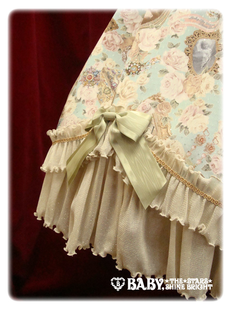
The skirt part has got a nice subtle rounded shape to it. I imagine it flares out nicely and will hold a decent amount of petticoat. The skirt doesn't have much detail on it, but at least this means the print is not concealed. Again, I am not a fan of the lace used on the bottom hem. Along the bottom hem the lace is very smooth and flat, which contrasts with the more gathered lace on the bodice. I also felt the bottom hem lace was a bit wide and plain.

This is the Candy JSK. The bodice is a nice shape. Although the straps are very plain, they are at least a little thicker than those on the other JSK. I belt the polka-dotted ribbon belt on the waist because it helps to make the waist look smaller, although it is concealed a lot when you have the waist bow attached. The waist bow itself is quite big but it has a nice defined shape and it looks more sturdy than the bow on the other JSK. Although I don't dislike the waist bow, I think the dress looks better with the bow detached. You can see the polka-dotted belt much better and this ties in with the cute polka dot bow that appears on the neckline. This dress also has a lot of lace with the vertical bits running up the bodice and the lace along the neckline. However, the lace here looks a lot more modest and tidier. The cherry lace is very cute and despite being wide, it is not over-powering. The back has a panel of shirring concealed by a ribbon corset. The ribbon blends in very well. The skirt lines appear to be straighter, but also look as though they will flare outwards more, holding a decent amount of petticoat. An A-line petticoat would probably be more suited to this dress than a sweeter cupcake shaped petticoat. The skirt design is kept simple and I like how it is not cluttered. The bottom hem is finished off with some good quality lace, although the lace used is a bit dull in appearance.


And here is the print close-up. This print is available in ivory, pink, sax, red and black. I think with a print like this, it works best with the red, black and pink colours. The sax is not too bad either. However, I really don't like the ivory colour with this print. I think a print like this deserves bright colours to help make the cherries stand out (I was going to say make the cherries "pop", but that just makes it sound even worse!). Am I the only one who thought this print reminded them of Bodyline? It just seems to have that Bodyline feel to it. The cherries are very cute. I like the use of light and shading to give the cherries a more shiny, realistic appearance. The ribbons and drape have that typical Baby look to them. The roses are a nice finishing touch. I think this print is a bit prettier than previous Baby cherry prints such as Cherry Fallin' Cherry.


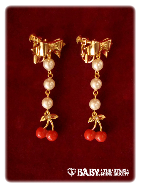
There are so many different bits of jewellery to choose from but I have chosen these earrings as my favourite. I think the bows are very cute. The gold colour with the ivory pearls also helps to make the jewellery look a bit more classy. I always think that Baby are really good with their jewellery and this series is no exception.

So overall, I do like this series but not enough to go out of my way to get it. For me, this series is all about the Candy JSK because I really dislike the Lilly JSK. Whilst the print is cute, I am not overly amazed by it either. I think I feel that I would expect something more from Baby. I would probably go for this print in black or pink. Whilst I like the red, I worry that the cherries blend in too much. I can't see this being a best-seller, especially when a lot of the other big brands are also releasing fruit prints at the moment. This series just doesn't stand out as a "must-buy" series to me. However, Baby does know how to come up with an amusing print name!

Wednesday 28 March 2012

Wait... Claire's Have Book Bags?

I randomly found this picture today.


It is a book bag! And then I saw the tag and the logo was all to familiar. Yes, these bags are indeed from Claire's Accessories. I believe this is from a Japanese branch of the shop (I have certainly not seen them in the UK). The quality is not going to be on the same level as the Innocent World ones but obviously they are going to be very cheap if they are being sold at Claires. If I saw a book bag in my local branch, I would definitely think about buying one. If anybody has seen these bags about then I would love to hear about it. I would especially love to hear if anybody has found these being sold in Claire's branches outside of Japan.

I think it is amazing how the same shop can vary so much between countries... and it looks like Japan is getting all the good stuff! Come on Claire's, show the UK some love too!

Monday 26 March 2012

Strawberry Parlour by AP

Today I will be looking at Strawberry Parlour by AP (fruit prints are all the rage right now!).This series has 3 dresses, a skirt, a head bow and socks. Additionally, some older strawberry items by AP have been re-released. I wouldn't mind getting my hands on the strawberry bag now I have a second chance!


This is the shirring JSK. Unsurprisingly, this means it has a lot of shirring! The bodice is a nice shape despite all the shirring and at least with more shirring you know it will stretch further and (hopefully) suit the wearer's curves better. I dislike large panels of shirring but it is not as obvious as I thought it was going to be. The ruched part on the front looks more like detailing than extra shirring. The shirring on the back runs all the way across and has nothing covering it, but the whole point of this dress is flexibility with the sizing. If it was me, I would just throw a pretty bolero over the top! I think the waist bow is a bit on the large side but it has a good sturdy shape. The bows by the straps (which are detachable) are made with very shiny ribbon, but I think they look cute. I think the dress looks a little plain with them detached. With so much shirring, the neckline could have looked messy, so thankfully AP have just added some good quality lace and I think the straps bows help too. The straps are a good width. These are also shirred so you really do have a lot of size flexibility! The skirt has that rounded and full shape that I have come to expect from an AP dress. It will hold loads of petticoat and has that perfect sweet shape. The print is not cluttered by any details and it is also displayed well with not too much gathering. The bottom hem is finished with cute strawberry lace, which I absolutely love. Overall, I think this dress has a very casual feel to it and I could picture this dress being easy to wear.


This is the tiered JSK. The bodice is well fitted. This dress has 2 sets of straps. Although the halter-neck straps are detachable, I think the dress looks better with them on because when they are removed, it makes the shape of the bodice look a bit strange. I just think the lines run a bit smoother with the straps still on. Again, the waist bow is large but it looks a bit more perky than the one on the shirring JSK. I like the lace with the ribbon threaded through it, and this is continued on other parts of the dress so the theme is constant.  However, I do think it is odd how the line runs across and points upwards at the sides. Above the lace and ribbon line, the top part of the bodice is ruched, which is very cute. The lace along the neckline is good quality and cute, and it is topped with a sweet little bow. The back has a panel of shirring, which is well concealed by a ribbon corset. The skirt part has a lovely flared shape to it, although I think the shirred JSK has the nicest skirt shape. Despite being tiered, the skirt does not look bumpy and it flows nicely. Halfway down the skirt, there is another line of that ribbon-threaded lace. It fits in really well and compliments the print. This line of lace is topped with small bows which look shiny, but blend in really well with the dress. The bottom hem is finished with more of the cute strawberry lace.


This is the OP. The bodice looks a good shape, but I really dislike the sleeves on this dress. I think the sleeves could have done with being a bit longer or maybe a bit puffier.

Instead of my attempting to describe the bodice, here is a picture! I think there is a lot of detail going on here and maybe it goes a little too far. It is definitely my least favourite dress in the series. I think what I dislike is the material layered over the sleeves because it makes the area look wider.


The detachable collar is very interesting. A lot of detachable collars seem to be kept plain, so trust AP to go a step further! The ribbon and bow design is very interesting. For me personally, I think it makes the collar look too OTT for my personal tastes, but I appreciate AP have tried to make it less boring.

This dress also has a large waist bow and there are no pictures on AP's site with this removed so it might not be detachable. I suppose it has a nice shape to it, but I like having the option of detaching waist bows! The back has a shirring panel. Although it is concealed with ribbon, the ribbon colour is contrasting and the ribbon is shiny. Therefore, it sticks out quite a bit. The skirt shape is rounded and full. It is very similar to the shirred JSK skirt and is thankfully kept free of cluttering details. The bottom is finished off with the same lace.


And here is the print close-up. I love anything with strawberries on it, so obviously I do like this print. Although with so many strawberry prints out there, this one doesn't really stand out. Despite not having stripes, I also feel this print is essentially a strawberry version of Fruits Parlour, with different colours. As you can see, this print comes in 4 colours. For me, there isn't a great deal of difference between the 3 light colours and so I really like all of them. I would probably go for the white or pink if it was me. I don't know why, but the black version looks less appealing to me. I love all the details with the strawberries and the desserts are making my mouth water! The polka dot ribbon with the stripy bit underneath mimics a cafe canopy, but with AP's typical cutesy style. I really do like the print, but as I said, there are loads of other brilliant strawberry prints out there.

Overall, I do like this series but I am not overly enthusiastic about it. I never thought I would be saying that about a strawberry print! If I had to pick, I would go for the shirred JSK (provided I could find a nice bolero to quickly throw on over it) or the skirt. I think that the white colour-way is the nicest, but there is not much difference between the colours. However, it could still be a nice addition to a sweet lolita's wardrobe.

Friday 23 March 2012

Cute little Bodyline accessories

Bodyline are doing a large small accessory update at the moment. There are already a load of new fake nails up (although I don't actually know anybody who has used them before) and now there are lots of new hair bits and jewellery up. A lot of the items are your standard sort of Bodyline items. I did pick a few items out though.


I have a real thing for roses. This sort of design is nothing new for Bodyline but in my opinion, it looks better than their similar older stuff. When I hosted the Feb Ox meet I got a few accessories from Bodyline and one of them was a rose clip. I thought that clip looked prettier in real life than it did on the website. I am hoping this is going to be the same.


I did consider teaming it with this skirt I already have from Bodyline (I have the black version). I don't actually have any hair accessories for this skirt as of yet because the matching head bow released was atrocious. The trouble is, the pinky looking one I was considering is in fact orange!


I like this cameo brooch. It would have been really cool if it had a 2-way clip on the back (like Chocomint do) so you can wear it more ways. However, there is enough room to glue your own clip on.


Another VW replica! There is nothing new about this design at all. You get a load of these VW replicas around Camden in London but this Bodyline version is cheaper... a LOT cheaper! Maybe one day I will save up for real Westwood, but until then at least I know there are options.

So these small little extras may end up in my next Bodyline order. They are not that new or exciting but the main point here is the cheaper price. My current favourite is the rose hair band!

Wednesday 21 March 2012

Mini Blings

I was randomly searching Etsy when I stumbled across Mini Blings- http://www.etsy.com/shop/miniblings

I sometimes think adding a quirky piece of jewellery to an outfit can be fun! A lot of my favourite pieces from this shop have themes which could be used with certain lolita prints, or I would wear them outside of lolita too.


I originally found the shop by searching for violins. This violin brooch is so detailed!


I am a sucker for anything Alice themed and these card suit dangly earrings would be a welcome addition to my collection of Alice inspired jewellery.


This sewing machine necklace made the classic lolita inside me squeal! I think this would be a lovely gift for a lolita who loves making their own pieces.


The print on the tea cup and saucer are so pretty.

Okay, so this one is totally random, but I love the idea behind this cute toaster necklace! That being said, I wouldn't have a single thing to wear with it.

The prices seem fairly reasonable, although you would have to add shipping from Germany on top. Maybe it would be better to order a few items together so the shipping price is more justified. I thought the items on offer were different. I would definitely love to find out what the item quality is like.

Monday 19 March 2012

Meta's Thorny Rose (a.k.a Secret Eden)

It has been a little late in coming, but today I will finally be looking at Thorny Rose by Metamorphose. This series has 3 dresses, a skirt, socks and a headdress.


This is the pinafore JSK. The bodice appears to fit well, but I am unsure I like the overall shape of the bodice. It looks very plain and I think the bodice is a bit too long. The waist bow is actually a belt, so you can tie the bow anywhere you like. It is good for defining the waist and also means you can play around and find a style to suit you. I think the bodice of this dress is very boring because there is a lot of plain fabric there. I understand that with a gothic print you would probably get less details, but I still found this dress very dull. The front does have 3 gold rose shaped buttons but they look really out of place when there is no gold anywhere else on the dress. The ruffle along the neckline stops the edge looking too harsh and the sturdy bow at the base of one set of the straps thankfully gives the bodice a bit of interest. This dress has 2 very thin sets of straps and I think I would have preferred one set of straps. The back has a panel of shirring which blends in very well and is concealed further by a ribbon corset. The skirt shape starts off quite straight but then gets more puffy towards the bottom (see the next photo).


Although the main material of the skirt is flaring outwards, towards the bottom hem of this dress where it meets the frill, it appears to go inwards. I dislike how this gives the dress a puffy balloon-like appearance. It gives the skirt part an awkward shape. I think for the best shape, you would have to puff out the top part with a fluffy petticoat to help even out the bottom. However, this kind of goes against the typical gothic lolita shape.


This is the switched pinafore JSK. The bodice part is very well fitted and has a pretty shape to it. The straps are a good width and work well with the circular collar. As the word 'switched' suggests, this dress switches between a solid colour part on the bodice and the printed part on the skirt. I think it gives the dress a very smart appearance. The solid coloured bodice is made from this material called "Koshibo Chirimen" which is not something I am familiar with, but appears to have a very rich, almost velveteen look to it. The bodice has lots of ruffles running vertically and along the circular collar. It is very simple, but I think this dress has a very mature grown-up feel to it. I really like it! The bodice is finished off with a waist ribbon, which blends in well with the bodice. It looks the right sort of size for the dress and finishes it off well. The back has a shirring panel, concealed well by a ribbon corset. The skirt part is very rounded but looking at the pictures, I think it works very well, even if the print is gothic. The print is displayed well and is not cluttered with detail. However, the bottom hem does look a bit plain. Overall, I think this dress design works the best.


This is the bustle pinafore JSK. The bodice is a nice shape. I really like the heart shaped neckline. Between the heart shape curves, there are some subtle ruffles and I really like this idea. It gives the area a bit more depth and texture. The straps are thin but about the right width for this style of dress.


I dislike the 2 harsh lines of braid running across the bodice. Design-wise, I think it looks out of place and sticks out. The bodice would look better without it. There is also some braiding running along the straps, but this is not as obvious. Whilst the bow looks the right size for the dress and blends in well, the cameo looks a bit droopy. I also don't think the colours on the cameo work that well because you don't see them anywhere else on the dress. So it sticks out a bit. I would get some nice jewellery to match the cameo if I were to get this dress. The shirring on the back is concealed well by a ribbon corset.

As for the skirt part... oh god, that bustle and gathering! If you look back up to the first picture of this dress, the skirt is really uneven, with the right-hand side looking comically shorter. I thought that maybe it was just that one photo but after looking at the other pictures, it is indeed like this in all of them. The skirt has a double layer of material on top, which is gathered at the waist (on the uneven side). It just looks really weird! Sadly, the bustle part on the back does not look much better.


I think my issue here is not the actual bustle, but the way the waist ties sit on top. It tricks the eye and makes it look like the bustle starts a little too high. Also, I think that even if you have the smallest backside in the world, this dress will make it look huge! I would definitely detach the waist ties here. The bustle itself looks like it is relatively flat and so it shouldn't cause much issue once the waist ties are gone. But the wonky appearance from the front is still a deal-breaker for me.


Finally, here is the print close-up. This series is available in black, green and wine. All the colours work really well with the style of print, although the black colour-way looks very shiny (but now there are more pictures, the shine doesn't look as bad as it initially did in the first pictures). I really do love it when Metamorphose decide to do a more gothic style print. I think this print is gorgeous and this picture doesn't really do it justice. The roses are really detailed and the horses are beautiful. As time has gone on, I have grown to like all the colours this print comes in, but I guess I would go for black.

So overall, I think this is a very beautiful print, but it is let down by the dress designs. The switched pinafore JSK is fairly pretty, but I personally will be avoiding the other 2 styles of JSK completely. But there is always the skirt! I can't see this series being a best-seller and I am really hoping my doubts about the dresses are just down to bad stock photos.

Friday 16 March 2012

Finally! Meta update their website!

I was talking with my husband recently about Metamorphose's international website and how annoying it can be (he works in I.T so we have these conversations a lot). The navigation is dreadful and we were laughing at how the website had not been changed for many years- apparently since 2004. I wasn't in to lolita then so I don't know how true that is. But if ever there was a brand website that needed changing, Meta would definitely take the prize.

So this morning I go on Meta's international website and I am greeted by this-


Yes, it would appear Meta have FINALLY changed their website! But is it any better? Yes, it is. It has all the categories the old international website had such as Go! Go! Lolita-chan running along the top, so they are very easy to get to. Upcoming reservations also have their own button, so they are quicker to find than they were before.


In addition to this, you can also access the shop quicker. The picture above is part of the left side menu. It makes it easier to find a specific series, but you can also choose a lolita style and a price range. Also included in this menu are the shop categories (such as dresses, accessories, etc) and their Japanese shop locations which open up a map if you click on a specific shop.


Meta also appear to be copying AP by having these buttons to find a series easier.

So I decided to try and see how easy the shop is to use by clicking a link to the dresses on the left menu.


Immediately, the dresses section opened up in a new tab. Because I clicked on the specific dress tag, only the dresses showed up. On the left I saw options for dress colour and price. But what if I now wanted to browse a different category?

I didn't initially see it, but at the top, there is a bit that says about 'selected tags'. It was set out like this-


Keyword:  -   (Reset)
Selected tags : EnglishReset) > DressesReset


So if I wanted to browse something different, I would have to click the reset button after where it says dresses. By doing that, it took me to the shop home and I was able to see every item again, not just the dresses. Whenever you click on an item, it will open in a new tab.

Keeping track of all these tabs opening up might be a pain but the new Meta website is definitely easier to use when compared to the old website. The website content is displayed a lot better and you can find what you are looking for quicker. It is also better for when you are looking for a specific item relating to a series. As you can see, although I browsed the shop I didn't attempt to use the shopping cart this time but I imagine it will be similar to how it used to be. After going on the Japanese website, it would appear that both are now in the same style as each other, which makes it more consistent.

So, I think this is a huge improvement. Well done Meta! Next time, please don't wait another 8 years before doing any more improvements!

Wednesday 14 March 2012

Crowns by Suppurate System- Want!

It took me 3 attempts to spell Suppurate correctly for the post title...

Have you ever seen a brand name thrown about but not really bothered to have a good thorough look? For me, Suppurate System is one of those brands. I rarely wear gothic (and even then it is probably not standard gothic lolita) so I have always overlooked this shop, thinking that I probably wouldn't find anything...


How wrong I was! I saw this crown being sold on the EGL comm and I decided to have a nose on the Suppurate System website for the very first time. I was greeted by loads of not just gothic items, but decadent gothic items! And as the word decadent suggests, the prices are a bit steep too. However, I can't help but love the crowns. The one pictured above is one of their decadent crowns. I guess the reason it appeals is because it has a very rustic look. The crowns I normally see are more polished but these crowns have a distressed and dark look to them. I like the idea of a "battered princess" or a more disturbed take on the princess style. Ever since I went on the Suppurate System website, I have been daydreaming about being a gothic princess. I am never going to overlook a shop ever again! I wonder what other delights I have been missing?


It is unlikely I will buy a Suppurate System crown because I cannot justify the price. However, looking at the designs, it makes me wonder if I would be able to make one myself. Because most of the crowns look a bit rustic, it wouldn't matter if it wasn't 100% perfect, as that would probably add to the design. I have spent a bit of time staring at these crown pictures wondering how it is done. I think I have figured out how to do the barbed wire and making the leather look distressed would be easy. So maybe I will give it a go.

Here are some other items I liked-


I know this is meant to be an eye patch but I would definitely use it as a hair accessory too!


Crosses tend to be a bit overdone with gothic style, but this wooden cross necklace appealed to me.


I love the idea of the rose being caged in this necklace. It conjures up a lot of images for me.


More crowns! This time the crown is on a ring. It has lots of detailing to it.

So I had a lot of interesting gothic ideas after visiting the Suppurate System website. If you would like to see more Suppurate System products, their shop is here- http://ssnet.ocnk.net/home

Monday 12 March 2012

Fragrant Rose by BABY

Today I will be looking at the latest series by BABY. It is called Fragrant Rose. the set has 2 dresses, a skirt, a head bow, a bonnet and lots of different pieces of jewellery.


This is the Camelot JSK. The bodice is really well fitted and will hug the wearer's figure well. The straps are a little thin, but the soft looking lace help to stop the straps looking to plain. Using the lace here also helps to balance out the bottom of this dress. The top bit of the bodice is ruched and I think it looks very pretty. The ruffle along the neckline also stops it looking to straight and boring. The bottom of the ruched area has a line of ribbon, which is shiny but still works well with the design. Then there is just a small ribbon bow in the middle. I don't think this dress would have looked so good if it had a waist ribbon as well. It would be too OTT with the other details on top of the dress as well.

Normally, I really dislike it when dresses have loads of ribbon corsets (this dress has 1 on each side and a third on the back) but it has been done so beautifully! I love the colour of the ribbon and how the edges are tidied up by some thin flowery lace. It also helps towards the wearer's silhouette because you will be able to tighten them if need be to help fit your shape better.

The back has a shirring panel concealed by a ribbon corset. The skirt has a pretty rounded shape, but not so round that it is too sweet for classic lolita. In fact, the rounded shape would probably be good for anybody who wanted to do a rococo or OTT classic outfit with this series. However... the way the printed part meets the tulle is dreadful. It gives the printed part and awkward shape. It looks odd, as if the printed part ends too soon or has been hitched up, exposing the tulle part. I love the idea of using tulle for this series but not how it has been used here.

 This is the Vivienne JSK. The bodice appears to be well-fitted and has a good shape to it. The neckline has a nice scoop shape to it. The straps are about the right width and look like they will give a good amount of support. Along the neckline there is a line of soft tulle lace which softens the neckline and also helps to balance out the detail at the bottom of the dress. There is no waist bow, but considering the amount of detail on the rest of the dress, it is not really needed.


I thought that the criss-crossed ribbon running down the front was a bit too clumped together. Maybe it could have been spaced out a bit more to give it a less bulky appearance. I am unsure about the chest bow. Whilst I adore the gold trim and beautiful lace (despite it looking a bit floppy on the top bit), I think the shape of the bow is a little strange. The top part of the bow looks a little squished and the overall shape is a little odd. I also would have liked the gold charm to be dangling underneath the middle instead of just placed on top.

The back of the bodice has a panel of shirring which is concealed well by a ribbon corset. The waist ties are attached by these very pretty pearl buttons lined with a golden edge. The skirt part on this JSK is not as rounded as the Camelot JSK but despite this, it still has a good shape for classic lolita. It looks as though it will flare outwards well and hold a lot of petticoat. The tulle part at the bottom looks nicely shaped and well spaced out.

Although some will say that the bottom of this dress reminds them of curtains, I think the soft layers work beautifully with the print. It has been presented well and the materials look good. Little touches like the gold trim and the well shaped bows help to finish it off perfectly. The ribbon used on the bows may have a very slight shine to it, but it looks like the ribbon is good quality and the bow is not too floppy. Quite frankly, I think the skirt part of this dress looks a great deal prettier than the skirt part of the Camelot JSK.

And here is the print close-up (here shown in Victorian). This print is available in Antique (ivory), Rosemary (green), Victorian (sepia brown) and noir (black). At first glance I thought that the print had a bit of a "grandma" appearance to it, but on closer inspection, it has grown on me. I like the decadent rococo look of the print. The detailed roses have a soft appearance. The cameos and frames help break up the flowers and add something interesting. The pictures inside the cameos look really beautiful! I especially love the detail on the frames; my favourite being the heart shape one. I have a feeling this print is going to be a case of the stock photos not doing it full justice. I would be really excited to see this print in person!


This choker is just one of many pieces of jewellery that have been released for this series. You really are spoilt for choice! I think the reason BABY have released so many different bits is because they believe the pieces will be quite versatile and easy to wear. Most of the jewellery has a very ornate and luxury appearance to them. The designs are very decorative and rich and have a regal feel to them. These really work with the dress designs but I think they could also work well with hime style.

Overall, I really like this series. My only issue is that I love the bodice on the Camelot JSK but I love the skirt part on the Vivienne JSK! Personally, I would go for the Vivienne JSK but I think it is a shame it doesn't have the bodice from the other JSK. The skirt on the Camelot JSK just puts me off too much. Whilst I like all the colours, I think for me the best colour is either the ivory or sepia brown. I think this series has a lot of potential because it has a luxurious appearance and is full of lavish details. I certainly wouldn't mind owning it.

Friday 9 March 2012

Innocent World Vs. Replicas

Just a quick note before today's post- from now on, all comments on this blog will be screened. This is after I discovered a few sneaky spam comments. Quite frankly, I should have done this sooner! Please be patient as I verify and publish your comments.

Please note I am not against replicas. The reason I am writing this post today is because I was very interested by a post made on EGL- http://egl.livejournal.com/18346910.html

It would appear that Innocent World are voicing their opinions on replicas. If you think about it, there are not really that many IW replicas about. However, as it has been pointed out on EGL, Innocent World have every right to voice their opinions. Although it might not change much (people will still buy replicas and some people will always be against them), all IW are doing is trying to is defend themselves.


I have to be honest... if there was a Lotta replica made then it would be very difficult to resist it, especially when you consider how hard Lotta is to get hold of. I can't help but wonder what IW means when they say they will punish customers who buy IW replicas with the knowledge it is fake. If you walk in to Innocent World's shop and you were wearing a replica, would you be banned from the store? (Although I think that even if you don't mind replicas, walking in to their shop like that would be very rude anyway!) Will replica makers be targeted?

This small statement by IW might not seem like it will change much, but it could easily start something off if other brands decide to join in as well. It is a bit naive to think that because some brands sell out of everything anyway, that means they are happy to let replicas exist. If other brands see that Innocent World have made this statement, they may feel more comfortable and confident about addressing the matter. And that could change the current replica situation. It feels like as soon as a new print comes out, immediately somebody will ask for a replica to be made. Will that be so easy when the replica makers are being targeted? So don't think that it is just Innocent World replicas that this affects.

What do I think? Regardless of my stance on replicas, I know Innocent World's statement is very true and well done to them for standing up against something that could threaten their company. At the end of the day, they are a business and their view is not at all surprising. If I was in their position I would probably be upset about my art being stolen too. However, at the same time I can sympathise with replica buyers who are unable to buy brand. I might have been interested by a Lotta replica, but IW's words have admittedly scared me!

What initially seems like a small statement could progress further. I will definitely be keeping an eye out for any news. Up until now, the big brands have kept fairly quiet so this is certainly an interesting development!

Wednesday 7 March 2012

Clobba Review- Navy Tea Parties (positive)

So, I ordered some tea party shoes from Clobba-  http://clobbaonline.com/ and today I will be doing a review. These actually arrived a week ago, but this is the first chance i have had to sit down and actually review them! I know there are probably a lot of Clobba reviews out there but I figured one more wouldn't hurt.

Please note the item I ordered was already in stock and not a pre-order.

Ordering Process

On Clobba's home page, you scroll to the bottom to find out how to order from them. It was easy enough to find, but maybe it would be useful to have such important information at the top of the page. You have to fill in a contact form and later on, an order form. Both the forms were laid out very simply and I had no issues filling in all the information.

Communication

As promised, Clobba responded within 24 hours to my emails. I was kept up to date with how my order was going. The information was clear and easy to understand. I felt very reassured.

Tracking and Shipping

My order was placed on February the 21st and shipped with tracking on the 23rd. Excluding the 23rd, it took 6 working days to get here. The EMS delivery time was predicted to take 5-10 days, so as you can see 6 days was very quick. However, I did have issues with the site I had to use for tracking. They were really slow to update the tracking. For the majority of those 6 days, I had no idea where exactly my parcel was and had to assume it was just between countries. I didn't know where my parcel was until all of a sudden, it said my parcel was loaded to the vehicle for delivery. It was a good job I checked at the right time, otherwise I might not have been in to sign for the parcel! 


My shoes arrived in a shoe box, which was covered in that strong plastic stuff. The red and white polka dots were so bright, that even Parcel force would struggle to lose this parcel!


The cardboard box was a little battered in places, but it kept the shoes safe. Hmm... that logo on the box looks awfully familiar! My only suggestion would be some more tissue paper inside to stop the shoes moving about so much.

And now I present my new shoes!


The colour was a bit lighter than I was expecting. I swear it looks a bit darker on the website. I think the best way to compare the colour would be to that used on Angelic Pretty's Blueberry Tea Parties. That being said, there are still lots of dresses I like which are a similar colour to these shoes. Although I now wont be wearing these with the items I planned, I think these shoes could be a good addition to my wardrobe later on. Therefore, I will be hanging on to these for a while.


The stitching is very neat. Maybe the stitches could have been the same colour as the main part of the shoe or the darker part of the sole, but that is just a minor issue. Overall, the shoes do look like a very good replica of the AP shoes. The bows could have been a tinier bit more neater, but I think they are pretty convincing!


It took me a while to figure out the ankle straps because I missed the popper at first!


The bow on the back.

The shoes were very comfortable and true to size. I had a bit of toe wiggle room but I always go a size up because of my wide feet, so this is understandable. They are really easy to walk in too.

So this has been a very positive experience with just a few tiny niggles. I am going to have to re-think what to wear these with, but I already have a few ideas. If you have any suggestions then feel free to share them with me! I would definitely recommend Clobba and I would use them again. I have no idea what their pre-orders are like but Clobba were very efficient when it came to sending out these already in-stock shoes.
Related Posts Plugin for WordPress, Blogger...