Thursday 28 February 2013

Twin Etoile by Angelic Pretty

Today I will be having a look at the latest release from Angelic Pretty. This series is called Twin Etoile. It includes 2 dresses, a skirt, a cutsew, a cardigan, a hair bow, a feather hair band, 3 pieces of jewellery and a pair of socks.


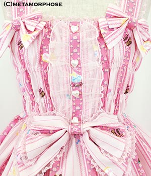
This is the Bustier dress. The bodice is well fitted, as you would expect from a bustier style top. The bodice is also a pretty shape. The waist bow is a bit soft and droopy, but it looks better this way. If this bow was stiffer, I don't think it would have suited the dress as well. The bodice has a ribbon corset on the front. The satin ribbon is a bit on the shiny side but I don't think the shininess looks too bad. The ribbon is well spaced out and is tied off nicely at the top. Both edges of the ribbon corset are lined with lace, which is good for disguising the edges. It gives it a neater finish. The lace on the neckline looks very pretty. The gathering gives it a lovely frothy appearance and I like how it gives the illusion of a slight heart shaped neckline. The back has a small panel of shirring which is concealed by a ribbon corset. The ribbon does look a bit bunched together here, but it does keep the shirring hidden. My only complaint would be that I wish the sizing was a bit more flexible so a wider range of sizes could wear it. The skirt has a very pretty rounded shape to it. It flares out really well, which I think it works great when paired with the tighter bodice. The overall shape definitely reminds me of a ballerina's dress. The print is displayed well because the skirt is kept clutter free. The bottom hem is finished off with some gorgeous crown lace, which I absolutely love.


This is the other JSK. The bodice is a nice shape. It generally appears to be well fitted, but there seems to be losse, baggy material in places. I really love the V shaped waist line. The neckline is a very interesting shape and lined with lace for a softer touch.


What is interesting about this dress is the way the straps have been done. The ribbon shoulder straps are topped with a line of pearls and finished with small ribbon bows. I am not entirely convinced by this detail but I think it is very interesting and a bit different. My only worry is that the straps don't look like they give much support. The pearls are detachable if you are not a fan.

The bodice has 2 tiny ribbon corsets on either side. I really love this detail and I think it has been executed well. The ribbon is well spaced and looks pretty. I dislike the raised panel at the top though. The shape reminds me of a bra. I think if it was a different shape I would like it more. The bow on top is an interesting shape. It kind of reminds me of a butterfly. I like how its a bit different. The pearl is a nice touch too, as it matches the straps.

The back has a panel of shirring which is concealed well by a ribbon corset. This time the shirring is a lot more forgiving. The skirt is a pretty shape. It is very rounded and full. It flares out beautifully. The skirt is topped with a small layer of chiffon. The chiffon is shaped nicely and I think it gives the skirt a lovely, romantic look to it. The print is displayed very well. The bottom hem is finished off with more of the awesome crown lace.


This is the print close up. As we can see from the picture the print comes in white, pink, lavender and black. I think all of the colours work very well with the print but for me, this series is all about the lavender! I think the lavender colour looks stunning teamed with this print. The only thing I am concerned about is that the colours in the actual print are quite soft and I worry the print blends in a bit too much. The print itself is beautiful. I love the ballerinas. The swans are very pretty. AP have proved that its not just Meta who can draw a nice swan! I especially love the ballerina shoes with the ribbon straps flowing to spell out Angelic Pretty. The feathers are a nice touch too and I love the inclusion of the melty moon.


I am a fan of the feather headpiece. The feathers are so soft looking and remind me of a ballerina's headpiece. So it fits in well with the theme of the print. The bow adds a touch of typical AP cuteness to things. I am already thinking up lots of different dresses this headpiece can go with! 


I like the idea behind the jewellery and the wing theme does suit the print. However, the jewellery is quite cheap looking. I have noticed it is mainly the white version of the ring and necklace that looks a bit cheap. To be honest, it looks like something that wouldn't look out of place at Claire's Accessories. The feather earrings with actual feathers are pretty, but a similar design could be picked up in a variety of places. If I was going to get the jewellery from this series I would stick with the silver colour.

Overall, I do believe this is a very beautiful series. I think this is going to be a strong seller. Would I buy it? Yes, I would probably get the bustier dress in lavender. I also wouldn't mind the matching feather headpiece. I probably wont add it to my wishlist at the moment but I would be more than happy to have this in my wardrobe. The jewellery is a bit of a let down but a quick search on Etsy is bound to bring up some gorgeous pieces that would easily match. I can imagine there are going to be some very beautiful outfits made with this series!

Monday 25 February 2013

Ox Loli 2nd Anniversary Meet!

Another year has passed! In February the Oxfordshire Lolitas celebrate their anniversary. We have now been officially running for 2 years! I ended up co-hosting with Sammi. We only stepped up to host this a few weeks before, so there was a real rush to get everything together. By some miracle though, we managed to do it!


We brought back a load of stuff from last year's anniversary, and that included me making cookies for everybody. I intended to write everybody's names on the cookies but it turns out I suck at icing, so I stuck to writing "OX" again this year. There were also a load of these cookies that I couldn't fit in the tins, and I am getting a little sick after eating so many of them now!


I was so focused on planning that I sort of threw a classic outfit together in the end. About 10 minutes before I needed to leave the house I suddenly had a massive panic and decided I really hated my outfit... but obviously I had no time to get changed! I even got to wear my Lockshop wig (although you can't really see the roses on my wig in the photos) and apart from a pin digging a little too tightly, I can say it was generally a very positive experience. I really wanted to wear this lacy bolero I found in Camden but in hindsight, I think it added a bit of bulk and I forgot to put my tight black belt on. Also, I don't think the cutsew looks quite right underneath the lacy bolero. But that aside, I was generally happy! I got to wear the first ever brand skirt I brought and found the matching hair comb didn't look bad when placed on the wig. And I will always try and find a good reason to wear my Secret Shop crown shoes!


 After going bowling we went to a Chinese buffet in the afternoon. Probably not the best choice for me, seeing as I was a bit unwell, but it was still fun. Pictured is my dessert. The mango cake on the right was yummy but the "mousse" was a bit suspicious... It tasted very strange!


And by some miracle, I managed to win Best Classic! I was genuinely surprised by that result as I wasn't very confident about my outfit and I felt the other girls had put a lot of effort in. I ended up winning back some of the prizes that I had brought and I also got a pretty rose corsage that Sammi made.


I really love the corsage. Sammi made them so well and it is lovely to have something so pretty to remember the day.


And here is a small group shot of us all. As Raine pointed out, this is the very first time that Metamorphose has taken over Angelic Pretty as the most worn brand!

Back row- Naimh in AP, Shalisa in Bodyline, Louise in handmade, Raine in Meta, Amber in Meta and Rachel in AP.
Front row- Sammi in AP, me in Meta, Roxy in off-brand (?), and Nicola in Meta.

Although I was very exhausted by the end, I did enjoy this meet. I was relieved to hear people say that they enjoyed themselves too. There were definitely plenty of laughs and silliness going on!

Thursday 21 February 2013

Magic of Scent in Love by Baby the Stars Shine Bright

Today I will be taking a look at the newest print from BABY. This series is called Magic of Scent in Love. This series includes 2 dresses, a skirt, a blouse, 4 hair accessories, a lace collar, socks and a necklace.


This is the Cologne JSK. The bodice is a nice shape. In some photos it appears to be well fitted but in others I thought the material looked a bit loose and baggy. The straps are a suitable width. The straps are a bit plain looking but thankfully, there is a nice amount of detail on the bodice, so I don't think this is a big issue. The waist bow is a bit big, but I think it suits the dress shape fine. It has a nice shape to it and appears quite sturdy. However, it is very basic looking with no real detail to it. It's a bit boring. I would have maybe liked to have at least seen a thin line of lace along the bow edges.


The bodice has a line of braid with a pretty line of lace underneath it. The braid colour is an interesting choice. It stands out against the rest of the colours on the dress. I can't decide whether I think this colour really suits this dress or not. The braid is quite a classic colour, whereas the other colours are very sweet. The bodice also has a double ribbon bow in the centre. The ribbon is very pretty and used well. The lace underneath is layered well and hangs nicely. The neckline also has pretty lace. It matches the other lace quite well and they compliment each other.

The back has a panel of shirring, which is well concealed by a ribbon corset. The edges of the shirring panel are also lined with lace, which keeps everything neat and tidy. The skirt has a lovely round and voluminous shape to it. It flares out really beautifully and will hold a decent amount of petticoat. The skirt is kept free of cluttering details, so the print is displayed beautifully. The bottom hem is finished off with more of the braid from the bodice. I am still unsure about the braid colour, but at least the bodice and bottom hem tie in with each other. There is also a line of dot lace on the bottom hem. Whilst this lace is pretty, I think I would have liked to see the lace from the bodice used here as well.


This is the Perfume JSK. The bodice is a nice shape but again, the material looks a bit baggy. The waist bow is a good size for the dress and a nice shape. Once again, I feel the waist bow on this dress is a bit too plain. I would have liked to have the bow lined with thin lace.


Whilst I think the bodice is very plain, I am a fan of the lacy neckline. The lace used is beautiful. It is layered well and is a lovely finish. It gives the neckline a very soft, feminine look. The lace is then topped with 2 delicate ribbon bows for a nice finishing touch. I really love this!

The back has a panel of shirring which is concealed very neatly by a ribbon corset. The lace around the neckline finishes neatly on the back as well. The skirt shape is again very full and rounded. It flares out beautifully and will hold a decent amount of petticoat. The skirt is kept free of any detail and so, the print is displayed really well. There is only one thing I really dislike about this dress is the bottom hem. BABY have chosen to finish the bottom hem with a pleat. To be honest, it reminds me of curtains! That being said, this is just a tiny little niggle and I wouldn't let something this small stop me from liking a dress.


Here is one part of the print close up.


And here is another part. This series is available in ivory, pink, red, sax blue and navy. I think there are times where the colours (especially on the pink version) look a bit washed out. You can still see everything in the print but it doesn't really stand out. It is very muted. I think my favourite is the ivory version, although I think the navy version is gorgeous too. It would seem cosmetics is a popular theme at the moment. This print is very cute. I really like the adorable sleeping bunny. The cosmetics are drawn really well and there is a lot of detail to the print. I seem to keep spotting more and more in the print, like the rose petals scattered amongst the make-up. The roses at the bottom are beautiful too. Overall, it is a very cute print.


There are the usual kind of hair accessories in this series but I couldn't help but smile at this bonnet headdress. It looks like a frilly night cap! It has so much lace. I don't think I would ever wear something like this. It is very old school looking and I can't help wondering if it would appeal to the modern lolita.

I think this is a series which will appeal to a lot of BABY fans. It has that typical soft, dreamy feel to it that BABY does really well. I don't think I will be adding this print to my wishlist, but it is definitely on my radar. I will be keeping an eye out for this print in the future. I would probably go for the Perfume JSK in ivory. This dress may be simple, but I think it has been done well. I will be completely avoiding the bonnet headdress but at least there are plenty of other options for head accessories. I have high hopes for this series!

Monday 18 February 2013

I Think I May Be Addicted...

It started off innocently enough... I was planning my outfit for the Oxfordshire Lolita's October Halloween meet and I really wanted some black roses just to finish off my "kuro bride" outfit. I was lucky enough to find some in Claire's for a cheap price. They may not last forever but they were good enough for the job. Then I saw they had the same style of rose clip in ivory and I thought they would be a nice addition to the classic side of my wardrobe. Then I found the navy roses and I thought I could use them in an outfit with my Midsummer dress. Then fast forward to the present and Claire's are bringing in their new stuff for Spring... What do I see? Even more of these rose clips. When I got home I decided to take a photo of all the Claire's rose clips I have obtained so far...


And before I knew it, I had 6 pairs of these roses in 5 different colours. The bad thing is, my obsession is still not satisfied. I spied some yellow, mint and red ones as well and I am itching to add them to my collection! I don't think I will be satisfied until I have these roses in every single colour!

I think the staff in my local Claire's branch must think I am a bit strange. But to find such loli-able items on the high street at a low price is a real bonus for me. There is no fiddling about with fake flowers and pins like I have done with previous outfits. All I do is clip these roses in and go. 

These rose clips are a huge part of my hair accessory arsenal now. I have a few outfit ideas in my head which will include these roses and I am also trying to come up with lots of different ways to wear these clips. I am going to use them in both sweet and classic items. I love their versatility.

I have recently spotted other items in Claire's which are very loli-able without being expensive. Sadly, I can't share some of them though, because it may give away a surprise! I definitely think it is worth having a look in Claire's right now though. Although, hopefully you wont become as addicted to stuff as I have!

Thursday 14 February 2013

Fancy Bunny by Crown Label

Today I will be taking a look at Fancy Bunny by Crown Label. This series includes 4 dresses, 2 skirts, 2 blouses, a hoody, a head bow, a hat and 2 different hair comb designs.

Unfortunately, I am having troubles getting pictures of the OP, but I will still give my verdict on the other dresses.


This is the shirring pinafore JSK. The bodice looks like it will fit well, but with all the shirring it doesn't have the most attractive shape. It looks a bit bumpy. The waist bow is a bit on the big side. Also, the waist bow looks a bit droopy. It looks very sad and could do with being a bit smaller and stiffer. The straps are a decent width. They are lined with thin lace, so they don't look as boring and the edges are softened nicely. I like the 2 bows at the base of both the straps. They are a much better shape and the size is suitable for the area. In fact, the waist bow isn't really needed, as the strap bows could work well enough on their own.


The bodice has some tulle lace running up it. I don't think it looks that pretty. I think it is the overall shape of the tulle. There is also something about it that looks a bit fussy and messy. The bodice also has a line of cute heart shaped buttons. It probably would have looked better without the tulle both sides of the buttons. Overall, I think the bodice looks really untidy.

The back has even more shirring, so the dress is fully shirred the whole way around the dress. Whilst size flexibility is a good thing, I think the shirring here looks very casual and it's not the prettiest design. The skirt is very triangular in shape and could maybe do with being a bit rounder. It looks like it will hold a decent amount of petticoat though. The skirt is kept free of detail and so, the print is displayed very well. The bottom hem is then finished with some nice lace.


This is the halter neck pinafore JSK. It is hard to tell where the bodice ends and the skirt begins on this dress. It has such a peculiar shape. But the top part of the bodice does look well fitted. The straps are very interesting. They are outer set of straps are topped with a ruffle, which is a bit different from your usual standard straps. I don't like how it looks with the halter neck straps though, as it is a bit crowded. However, the halter neck straps are detachable. This dress comes with many detachable bow brooches which is a bonus, as it means you have more control over how you wear the dress. The smaller bows are very cute and have a nice sturdy shape to them. The bigger bow seen in the picture, attached to the neckline, also has a nice shape to it. I think it looks good placed on the neckline and sits nicely here. Or you could use it as an emergency head bow. The neckline is lined with lace, which gives it a softer appearance.


This dress also comes with a detachable bow with a pom pom attached to it. From the picture we can see that Meta suggests wearing it like a bunny tail. Whilst it is an interesting idea, I think it looks a bit silly! The back has a panel of shirring, which is well concealed by a ribbon corset.

The skirt shape is hideous though. Looking at the overall silhouette, the dress looks lumpy and bumpy. It's not flattering at all. The skirt starts too low. It seems to look worse when the skirt is fully puffed outwards. It's just awful. There is not a single thing I like about the dress shape and I would never wear it. The bottom hem is finished neatly with some okay lace.


This is the cross over back pinafore JSK. The bodice is an okay shape, although the material looks a bit baggy in places. The belt is a nice idea, but would probably look better on the actual waist, rather than being slightly dropped. Also, I would have liked the belt to be a solid colour. I think having the stripes in the print going in different directions looks a bit strange. But the buckle is very cute. The bows are again, detachable. I would probably space them out a bit wider apart than Meta have in the stock photos, as the lower part of the bodice looks a bit plain. The bows are a cute shape and very perky. I do also like the flexibility with them being detachable. The neckline is lined nicely with thin lace, which is not too distracting but gives a softer appearance. The straps are a nice width, but I am not sure the design really suits the dress. As the name suggests, the straps cross over at the back. The back has a panel of shirring, which has been left exposed with nothing covering it. It looks a bit messy and could have maybe done with ribbon covering it. The skirt is very short. It almost looks like a salopette. But despite being short, the skirt does have a nice shape to it, especially when compared to the other JSKs in this series. The skirt flares out well and the print is displayed beautifully. The bottom hem is then finished off with some nice lace.


And finally, the print close up. This print is available in pink, black, yellow and green. For me, the black and pink are the better colours for this print. The yellow is not the nicest shade and I am unsure the shade of green is a good match for this particular print. The print itself is quite cute, although it feels like some things have just been randomly chucked together. I don't quite understand what the bunny has to do with the rest of the print but it is cute. I love all the little cosmetics and the dresses in the background have been drawn well. However, as far as cosmetic prints go, this is not one of the best designs available. Other brands have done cosmetic prints better and even other Meta prints (such as perfume bottle) are more desirable than this one. I do like the stripy background with the tiny flowers though. Overall, this print is not for me.

So whilst this is a cute print, I don't think it is anything spectacular. The dress designs are a bit questionable. I just hope they look better when actually worn. I don't think I would buy from this series. It not my kind of thing at all. It's a shame, because Meta had been releasing some pretty awesome stuff lately. Let's hope we see more of these better Meta pieces soon!


Monday 11 February 2013

Sorry- no post today.

I'm sorry for not posting today. Something came up, which I have to deal with. And once again, I don't have a post stockpile to dip in to when these things comes up. I definitely need to rectify this. Anyway, I am very sorry and things will be back to normal on Thursday.

Thursday 7 February 2013

Alice's Tear Bottle by Alice and the Pirates

Today I will be taking a look at the latest print from Alice and the Pirates. This series is called Alice's Tear Bottle. It contains 2 dresses, an apron style skirt, a blouse, a head band, socks and a few pieces of jewellery.


This is the tassel JSK. The bodice appears well fitted and it is a nice shape. The straps are a decent width for the dress and are lined with lace, so they don't look too plain. There is a waist bow, placed to one side. The bow itself is a nice shape and is very perky. It stands up quite well. I am a little unsure if I like the size and placement of the bow. I am also not a huge fan of the tassel hanging from this bow. I think it maybe looks a little plain having one single tassel hanging like this and perhaps two tassels would look better. Also, I don't think the tassel looks right when paired with the bow. The bow is quite sweet and maybe something a bit more classic looking would have suited the tassels better. Perhaps the tassel idea would have worked better dangling from the ends of a belt or perhaps underneath a rose corsage? As it is, I don't think the bow and tassel looks quite right. The bodice has a line of ribbon running across the chest area. I am always a bit wary of these kinds of details as one some wearers, it tends to sit on the chest awkwardly. I probably would have preferred the ribbon line to not be there. The ribbon itself looks good though with only a slight bit of shine to it. The ribbon line is topped with a ribbon bow. I don't think the bow here is really necessary, seeing as there is already a waist bow and one on the neckline. However, both the ribbon bows are a nice size and shape. They are spaced quite nicely too. The neckline is lined with lace, which gives it a nice, softer edge. Now, unfortunately I wasn't quick enough saving the pictures and I don't really remember what the back of this dress looks like. Judging by the measurements though, I am guessing it has a panel of shirring, which is great for size flexibility. The skirt has a beautiful, full and round shape to it. It is maybe a bit sweeter than we are used to seeing from AatP, but I think it suits the print. Also, some of the colours look a bit sweeter than your typical AatP release anyway. So I consider this more exaggerated skirt shape a bit of a bonus. The skirt flares out beautifully and will hold a decent amount of petti. The skirt is free from cluttering details and so, the print is displayed really well. The bottom hem is then finished off with some good quality lace. I thought it looked quite pretty at first, but then I saw the lace used on the other JSK and wished they had used it on this dress as well! Still, the lace doesn't look bad, I just think the other JSK's lace is prettier.


This is the Heart Belt JSK. The bodice is a nice shape and looks very well fitted. The straps are an okay width. This time the straps are kept free of lace, but I think with this particular dress, sharper edges looks better anyway. The waist has a belt, which looks very neat and tidy. It nips the waist in brilliantly. It has a very cute looking heart shaped buckle, which is a nice finishing touch.


The bodice has 2 lines of lace running vertically up the bodice, which do blend in a lot, but gives the bodice a bit of added texture and interest. There is also a line of buttons, which I think work well with the rest of the design. The thing that catches the eye with the bodice is the flaps of solid coloured material on the neckline. I like the idea of the solid colour flaps and they are a nice shape, but I think I would have preferred them to be a bit smaller. The flaps are lined very tidily with lace and it is very neatly done. What I didn't notice until I stared hard at this photo was that actually, the panels are covered with dot netting. It probably wont be that noticeable unless you are right up close to the dress. I kind of wonder what the texture is going to be like though. I have some Bodyline pieces with dot netting like this and whilst I liked the look, I wasn't too keen on how it felt.

The back has a panel of shirring which is concealed very neatly with a ribbon corset. The skirt is once again, a bit fuller than the average AatP dress but I still think it suits the series better to have it this way. The print is displayed beautifully and the skirt is kept free of cluttering details.


As I mentioned earlier, I really love the lace used on the bottom hem of this JSK! I think the heart shapes look so pretty. It also fits the theme of the print well. 

 And here is part of the print close-up...


... and here is another part. This print is available in off-white, sax blue (no surprises there!), pink and black. I think out of the colour options I like the off-white and sax the best. I know sax blue and Alice prints has been done to death, but I really like the use of colour in the print on the sax version (as seen in the first of the two print close-up pictures in this post). As for the print itself, it has all your typical Alice themes in it, but it has been paired with lace and tassels, which is a bit different. I think the lace in the print looks beautiful. So much detail has gone in to it! The tassels are an interesting addition and I think they have been used and placed well within the print. I really love the use of glass bottles too, with the Alice characters inside the bottles. Everything looks so pretty! I especially love the rabbit. Then again, I may be a bit biased as I can never get enough of Alice in Wonderland prints, even if it has been done to death.


I am not a fan of the socks from this series. To me it just feels as though the "Drink Me" text has been slapped on. Apart from the text, I do think the socks are pretty. The bottle is drawn nicely and the bubble design is interesting. But then, the text on top looks so plain and ordinary. It looks a bit of of place to me. I think the text could have been done in a more interesting font and placed differently.

So I do think this is a very lovely series. I know some people will be rolling their eyes at yet another Alice themed print, but I think this is definitely one of the better Alice prints out there. Would I buy it? Possibly. I wouldn't call it a "must-have" print, but I wouldn't mind owning it. If it was me, I would go for the heart belt JSK in sax blue. I think this could be a lovely addition for anybody who collects Alice themed lolita. I will be avoiding the socks though!


Monday 4 February 2013

Cambridge Satchel Company

Late last year, I decided to think about bags to suit classic lolita and decided to Google satchels. It didn't take me long to discover my new wishlist item- a satchel from the Cambridge Satchel Company. Satchels to me, bring an image to mind of a young school girl sent off to school with her satchel in hand. You don't really see kids using satchels any more, so they have a real nostalgic feel to them. I have a feeling the owner of the Cambridge Satchel Company feels the same way and wanted to recapture that nostalgia. Satchels also have the benefit of being quite practical and sensible to use in other situations, such as work. The website is available here- https://www.cambridgesatchel.co.uk/

I already own a Primark satchel but to be honest, it's not that well made and it looking a bit battered after being chucked to the back of my wardrobe. But these satchels here seem to have so much love and attention put in to them. What I love about the Cambridge Satchel Company is how everything is made to your specifications. You can choose the size, whether it has a handle or not, and you can even get them embossed. I feel this makes them more personal to the user.


My biggest regret is that I didn't find out about this company sooner. Last year the Cambridge Satchel Company brought out a pastel collection. I REALLY want the lavender satchel from this collection. Unfortunately, the collection is long gone now. I love the delicate shades in this collection. I thought the lavender satchel would make an interesting, more grown up bag for sweet lolita. At a push, I would have probably used it for classic too. Sadly, unless I find one up for auction, it is probably never going to be in my possession. If anybody sees one, let me know!

The other alternative would be to get a pastel satchel from Zatchels- http://www.zatchels.com/bags/collection-category/pastel-collection.html

Zatchels have been accused of ripping off the Cambridge Satchel Company designs and it is fair to say, the bags do look pretty similar. However, the violet bag in the Zatchels collection is not as nice in my opinion, and not the colour I was looking for. But despite this, I do think that the baby pink, baby blue and ivory ones from Zatchels are very pretty. I especially like the look of the baby pink one. So maybe I will give in and get a pink one sometime.

Out of the 2 companies though, it is the Cambridge Satchel Company who have won my heart. I feel that so much love goes in to those bags. Here is hoping that somebody auctions their lavender satchel or that they release another pastel collection at some point!


Related Posts Plugin for WordPress, Blogger...