I love lolita fashion and usually I will look for any excuse to wear my frilly clothes. Going to meets is a fantastic way to see the friends I have made through this fashion and I am very lucky to live close by to several local communities. But despite this, I will sometimes be preparing for a lolita meet and I will wonder whether it is really worth all the effort. This is nothing personal against the people I meet with, it's just that sometimes the one thing I really crave is a lazy day, slobbing out on the sofa and not really doing anything. For me, going to meets requires getting up earlier than usual, spending a lot more time getting ready than I usually would and praying for some decent weather. To be fair, once I have made the effort, I do really enjoy myself at meets and I am glad I went. But if I haven't been to a meet in a while or if I am feeling depressed, it is really difficult to push past that reluctance to get myself ready in the morning. You know you are going to have fun, but you just have to push past all that preparation and feelings of doubt first!
How exactly do you make this easier? Is it just me being lazy, or is something deeper going on? I have been attempting to come up with ways to make sure I get through the preparation and make sure that I do attend meets.
First things first, I always make sure that I do any preparation I can before the day of the meet. Whenever I go to a meet I always lay my outfit out the night before, make sure my bag is packed with the stuff I need and get all the hard stuff out of the way. That way, on the morning of the meet, I know where everything is and I feel reassured that everything should be sorted. I find making lists is helpful too. There is something very satisfying about ticking items off a list!
I also come up with music playlists full of songs to get me in the mood to meet up. I play whatever songs I happen to like at the time. I have noticed I seem to go through weird phases where I really love listening to certain songs. They don't even have to be really cheerful songs, just songs that you know you love and really want to listen to. Strangely, one of my current favourites is Psycho Killer by Talking Heads (don't ask...). All I know is, that when I listen to music whilst putting my make-up on, I feel more geared up for facing the day.
I also like to treat myself at meets. When I am at home, I don't usually allow myself that many treats. I mostly drink water, eat fairly small meals and lead a pretty simple day-to-day life. I don't deny myself treats, but I also don't go overboard. As somebody who does unfortunately have social anxiety, I do see leaving the house and meeting up with people as a big deal. So yes, I will treat myself when I go out, because I come to associate leaving the house and making an effort to meet people with positive feelings. I know this may be hard for some people to understand, but for me, this is a really huge deal and I honestly feel like I have achieved something.
It is also important that if there are issues within the group, that you at least try to sort them out. If you have had some sort of disagreement with one of the guests, then you are less likely to want to attend the meet. It can feel very horrible when you can sense these negative vibes amongst your group. Sometimes arguments can't be resolved, but at the very least attempt to do try to fix things. At least then you can say you have tried. It is very rare that you will become best friends with everybody in your local community, but it is important to try and remain civil with those you don't get on as well with.
And finally, if you are not new to meets remember the clothes, the friendships and how much you have enjoyed past meets. Look through old photos, go through your wardrobe and just look at things, remember the happy times. I am always making up outfits with my wardrobes, even when I don't have any meets coming up, because I find it reminds me why I love this fashion so much. Creating new outfits is one of my favourite things about lolita, so that is what I focus on. Try to remember why you got in to lolita and why you still wear it today.
I have found myself in a bit of a lolita meet slump before and have found myself almost not going to meets, so I do understand how it feels. I do hope this post is helpful to somebody out there. If nothing else, I just want you to know that you are not alone.

Thursday 26 February 2015
Monday 23 February 2015
Wrapping Heart by Angelic Pretty (and another Valentine thank you)
I got another Lolita Valentine this past weekend! This time it was from Shalisa. Thank you so much! I am number 2 this week- http://loli-valentines.livejournal.com/193006.html#cutid1 I am really happy to see that there are new mods trying to revive the Valentines and that more people have been posting (that Valentines 2-parter was epic!).
Today I shall be taking a look at Wrapping Heart by Angelic Pretty. This series includes 2 dresses, a salopette, a skirt, a hair accessory, tights, a blouse, a cutsew and a pair of wrist cuffs.

First up is the OP. The bodice seems fairly well fitted. Overall, the bodice shape is very cute, although perhaps a little too cute for some people. The sleeves have a suitable amount of puff to them, but I think they could have done with being a little shorter. The ends of the sleeves have been finished off very neatly but there is a lot of detail here with multiple layers of lace and bows on top. It is a bit too OTT. The bows on the sleeves could do with being a lot smaller or not being there at all. The white cuffs and lace could do with being narrower as well. The bodice features a wide yoke that takes up almost all of the bodice. I have to admit, it looks like a frilly baby's bib to me. But putting my personal tastes aside, I admit the yoke has been nicely done at least. The lace around the edge of the yoke is pretty and of a good quality. The material of the yoke has been neatly pleated for a bit of added texture and detail. The multi-coloured bows running up the middle are a cute shape but could have been a lot smaller and I don't think I would have bothered with the buttons placed between the bows at all. My main criticism is with the shininess of the yoke material, the collar and also the ribbon used for the bows on the yoke. The collar is a cute shape but I think it could do with being a lot smaller. The back of the OP is generally quite plain and there is no shirring, so size flexibility is limited. The zip is well concealed but I don't think the print lines up along the zip line that well, judging by the stock photos. One slightly random inclusion on the back is a bow made of the printed fabric, which attaches right at the top of the back, where the collar is. I feel this little detail is too fussy and I personally would detach it if it was me wearing this. On most people this bow detail is going to be lost anyway, unless the wearer has short hair or wears their hair up. The stock photos show that the high waisted skirt has a good amount of volume and reasonable amount of puff to it. However, I really dislike the way the skirt flares out from the waist. I can't quite put my finger on what it is about this I dislike though. Maybe it is just too cutesy for me. I also feel the shape of the bottom of the skirt looked a bit strange in some of the stock photos, almost like a balloon. The skirt is kept simple in design and the print is displayed beautifully. The bottom hem is finished off with a simple chiffon ruffle, which I don't think has been attached that well. I do wonder if perhaps lace would have been a better choice here.

Here we have the JSK. In some of the stock photos I felt the bodice material looked a bit baggy and seemed to hang off loosely. It also lacks any real shape and looks a slouchy mess. The straps on the dress are very thin and look quite flimsy, although wide straps would have probably not suited the rest of the dress. The straps are very simple in design but do feature little bows on the shoulder area. However, I don't feel the bows on the straps really add anything to the design and are mostly hidden anyway. The waist area features a big bow. The bow size doesn't seem to bad and the shape is quite cute. The bow is lined neatly with lace that isn't too distracting and in most of the stock photos the bow sits on the dress really well. But teamed with the small bows along the neckline, the waist bow feels a bit too much and I probably would have gone with a simple belt design instead of a bow. The bodice features some subtle lines of lace running up it, which at least helps to break up the plain areas a bit. The neckline features a ruffle of the printed fabric, which is topped with lace and 3 bows. I don't really like the ruffle and would have preferred lace instead. The bows are a cute shape but again, the ribbon used is far too shiny. The shininess makes the bows stand out, and not in a good way. I also don't feel the bows have been well positioned and need to be spaced out much better. The back of the dress is fully shirred, which is a bit messy looking. However, the back is quite short anyway and the solid coloured waist ties help to conceal the shirring a little bit. The stock photos show the skirt has plenty of volume and flare to it. However, in some stock photos the skirt material drapes strangely, creating random gathered areas and lumpy bits. The skirt design is again kept simple and the print is displayed quite well. The bottom hem is then finished off with some subtle thin lace and then a wide ruffle of chiffon. I personally feel the chiffon looks a bit out of place and it is also too wide.

And finally, here is the print close up. This series is available in yellow, mint, lavender and blue. With the cutesy dress designs, I suppose I can understand the choice of pastels. However, I am a little disappointed that there wasn't a slightly more mature looking colour offered. I am not usually a fan of sweet prints on black, but I think in this case black would tone down the very sugary print colours a bit. An ivory colour way could have also been a nice choice. As for the print itself, it is very colourful with lots of pastels. There have been some quite mature looking prints featuring present boxes before but this one is very cute. This isn't a bad thing for those who love OTT sugary Angelic Pretty series but it isn't so great for everybody else. The presents themselves are well drawn though. I love the use of detail and the ribbons have a lovely shape to them.
So overall I feel the dress designs, colours and the print are all super cute. Unfortunately it is too OTT and there is not a single dress design or colour option which I feel offers a more mature option. I think it is a shame, because I would have maybe liked this sort of print if there was a more toned down option available. But with all these sugary details and colours, I would not buy this series. I don't think I would feel comfortable wearing either of the dress designs. I would have considered the skirt if there was a black colour way. If I absolutely had to pick an option from those available I guess I would pick the lavender JSK. But this is one series I will definitely be avoiding.
Thursday 19 February 2015
Those Hard to Co-Ordinate Pieces
Most lolitas have at least one in their wardrobe... It is not just new lolitas that suffer from this issue and I know that even after a good few years, I probably haven't seen the last of this nightmare. Every now and then you will come across a main piece in your wardrobe that you dread creating outfits for. For some reason, you feel like nothing seems to work with this troublesome main piece and even if you do manage to create an outfit, you feel like you could have created something a lot better.
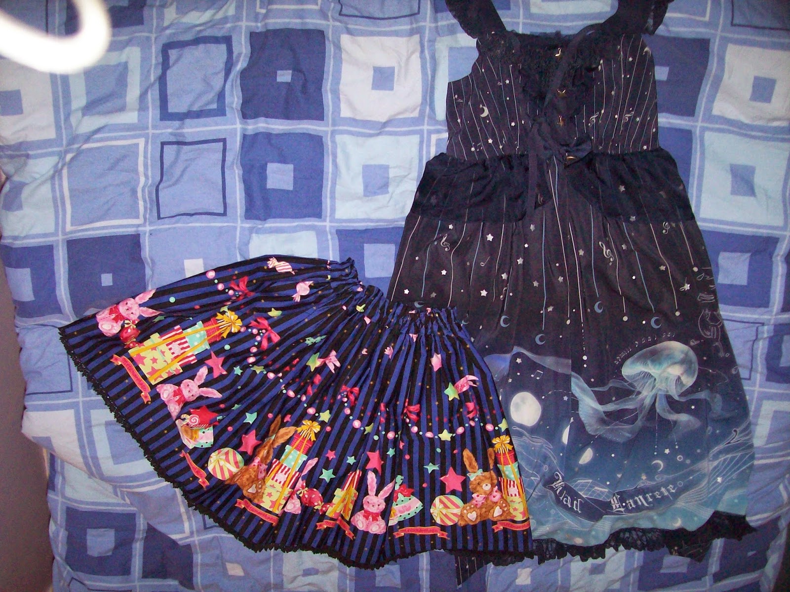
For me, this picture of my Enchanted purchases from last year is very related to this topic! It was only a month ago that I finally got to wear Candy Star Rabbit, and Enchanted was the best part of a year ago now. As for my Jellyfish dress, I am yet to wear it. It took me so long to come up with an outfit for Candy Star Rabbit because the blue was so different to everything else in my wardrobe. With so many colours in the skirt, I think I was a bit overwhelmed and I didn't know what colours to use. Everybody else seemed to be using black and the matching hair accessories in their Candy Star Rabbit outfits but I don't have the matching hair accessory. In the end, I ended up adding another colour (red) to my first Candy Star Rabbit outfit. I am not saying the outfit I wore was perfect, but I felt comfortable in it and I was pleased that I was able to overcome this issue I was having with creating outfits for it. As for my jellyfish dress, that is currently a work in progress. I think my issue with this dress is that there are a lot of different themes going on and every person I have seen wearing it seems to be wearing it in the exact same way.
As you have probably gathered from this post, I am still learning how to over-come this issue. I am lucky to have a reasonable sized wardrobe, so there is always some new outfit to put together with the pieces I have. But it makes me feel sad knowing some of my pieces are being a bit neglected and pushed to the back of my wardrobe. I spent money on these items, so I should be trying to make the most of them. So I will share my thoughts and ideas to combat the issue that I have discovered so far.
Firstly, you need to make sure your wardrobe staples are well stocked. Sometimes shopping for the basics can be boring but it is worth it when it makes your wardrobe more cohesive. Make sure you have a ready supply of items in staple colours. White, ivory and black are good colours to choose for staple wardrobe colours. Most main pieces will go with at least one of these 3 colours. There are also some quite generic themes that are worth stocking up on. For example, bow themed accessories and jewellery are easy to find and go with lots of sweet pieces. For classic, pearls and flower accessories are good to stock up on. You don't have to spend a lot on stuff like this. I have a mix of bow themed jewellery from places like Chocomint, Claire's Accessories and even Primark. Yes, relying on staple colours and simple themes may not make for the most interesting of outfits, but with difficult main pieces it is usually best not to go too OTT at first. If you go too OTT too soon it can just add extra stress.
Recently I have been using a new method for getting the inspiration flowing. I will look up the main piece online and see how everybody else is wearing it. But I wont just look up good outfits, I will look up ones I don't like as much as well. I will print them off and then write a massive list of everything I like and dislike about the outfit. It is worth taking the time to really nit-pick the outfit and go over every little detail. Even if you really dislike an outfit, writing these lists will help you work out what you should and shouldn't do when you try to co-ordinate this main piece yourself. Compare the lists you have made for each individual outfit and see if there are any common remarks you have made that jump out at you. Obviously this wont work with brand new releases but it is good if you don't mind waiting a few months or are working on an older piece.
If all else fails, there is always the option of asking others to come up with their own ideas. If you don't mind the possible negative comments, cgl can actually be a very helpful place to get an outfit collage done for you. Look out for their Co-ord Help Threads or if there isn't one, create your own thread. Another option is Collage Anon on Tumblr, who can sometimes not respond right away but is quite friendly and helpful.
It was using these techniques which helped me to put together my Candy Star Rabbit outfit. I used some ideas that I found online and then added my own little touches so the outfit felt much more personal to me. Even though I needed a little help, I was eventually able to create my own outfit. Sometimes the inspiration takes a little while to get flowing. I think once you get that initial first outfit out of the way, it boosts your confidence for future outfits. I know I am not worrying about my next Candy Star Rabbit outfit. In fact, since I have worn my first CSR outfit, I have actually come up with some of my own ideas which I didn't think of before. And so, it is on to my next challenge... I am going to come up with an outfit for Krad Lanrete's Jellyfish print!
Monday 16 February 2015
Fortune Tarot by Metamorphose (and a Quick Thank You)
I would just like to say a quick thank you to Sammi for making us a Lolita Valentine this week! We are number 34- http://loli-valentines.livejournal.com/192451.html#cutid1
Today I shall be taking a partial look at Fortune Tarot by Metamorphose. This series includes 5 dresses, 4 hair accessories, socks, tights, lace sleeves, wrist cuffs, a scarf and a blouse.


This is the Princess OP. The bodice seems fairly well fitted. I'm not overly fond of the bodice shape though, as I think it looks a bit frumpy. The neckline is a very basic square shape and the sleeves look awkward. The bell part of the sleeves has a nice amount of flare to them but overall the sleeves feel far too fussy. With bows, lace, tulle and a very busy print the sleeves are overdone. Also, I don't feel a princess sleeved dress works with this sort of print. I certainly wouldn't usually put tarot cards and princesses together. The waist area has a solid coloured panel which I think is a good thing, because it at least helps to break up the busy details a little bit. However, I don't like the waist bow on top of the solid coloured part as I feel it looks awkward and out of place. It also looks too OTT and sits strangely on the dress. The waist bow doesn't have the most appealing of shapes either and the pearl chain dangling from it is poorly positioned. The solid coloured part runs all the way up the bodice and down the skirt, and it is lined with a tulle ruffle on either side. The tulle does help make the edges look neater, but I think the tulle is too wide. On the bodice, the solid coloured panel has 3 ruffles of tulle running across it which are additionally topped with lines of ribbon and printed fabric bows. Again, these details look crowded and too OTT. The bows are a cute shape but need to be a lot smaller. Thankfully these bows are detachable and I do feel detaching them does improve the bodice somewhat. The back has a panel of shirring which is topped neatly by a ribbon corset. The stock photos show the skirt has loads of volume and flares outwards well. The overall shape is quite pretty and despite being tiered, the tiers have been layered reasonably well. I do feel this is one of those dresses where you would have to choose your petticoat carefully though. The solid panel part of the skirt is topped with 3 wide ruffles of tulle. The tulle is layered quite nicely and sits well here and I suppose it does help to balance out the tulle on the bodice. The tulle ruffles to the side of the solid coloured part are topped with 6 small bows. Although I have criticised how OTT this dress is earlier, in this instance I think the dress looks better with the 6 bows still attached here. The bows have a cute shape to them and I just wish they were a little bit smaller. The tiered skirt design actually works quite nicely with the print because the print is made up of squares anyway, so the print is easy to break up in to layers. My only issue is the top tier has been over-stitched instead of under-stitched, which I think looks a bit messy. Despite all the detail, the print is still displayed fairly well at the sides and back. The bottom hem is then finished off with a line of tulle, which at least carries on the continuity of tulle elsewhere on the dress.

Here we have the High Waist Pinafore JSK. The bodice looks somewhat well fitted, although the neckline plunges far too low. The neckline shape is too harsh and a softer heart shaped neckline that ends higher up would have been better. The straps are a suitable width but the way they attach to the dress looks a bit strange. The straps are also very plain looking and at the very least I would have liked some thin lace lining them. The bases of the straps are topped with bows, but the shape of the bow is too simple and they look far too basic. The dress does not have a defined waist line and instead there are lines of thin lace lining the lower chest area. I do feel the lines of lace make the bodice look like a bra shape and it isn't the nicest looking of bodices. The neckline is topped with a double layered bow. I don't think the layering of the different coloured materials works for this bow and once again, the bow shape is far too basic. The bow is detachable but I think the dress looks too plain without it. The back of the dress is fully shirred which means the shirring is quite exposed. But the shirring does blend in a little bit with the print. The stock photos show the skirt is quite full and flares outwards a lot. I don't feel the overall silhouette flows that well though. The skirt design features 3 gathered ruffles at the bottom. At the top of the top tier there is a line of gold braid and small bows which blend in very well with the rest of the dress. The tiers are well spaced out and sit fairly well on top of each other. The very bottom tier looks like it could do with a bit more volume, although that may be due to the petticoat Meta have used for the stock photos. My main issue with the tiers is that from the photos, you can see that the cards in the print have not been lined up that well and some of the cards have been cut in half.

Next up is the Low Waist Pinafore JSK. The bodice is very well fitted, although the shape is quite simple. I also feel the neckline shape is quite harsh and needs to be softer. The straps are a good width and look quite supportive, although I'm undecided about the way they have been attached to the dress. The low waist features 2 lines of lace, which create a 'belted' appearance, although this detail does blend in a fair bit. I think a solid coloured belt would have looked better because it would have made the other solid coloured parts of the dress look a bit more balanced out and it would have also broken up the busy print. The waist details are topped with a solid coloured bow made from more of that koshibo chirimen fabric, which again looks quite shiny. The bow is quite a simple shape, but looks quite cute. I think it could have been placed on the dress a bit better though, as it sits a bit awkwardly. The bodice features many lines of thin lace, which gives the bodice a panelled appearance, although this detail is a bit lost in the print. There are also some small bows running up the centre of the bodice which are well spaced out. However, they do look a bit wonky in some of the stock photos and also, the very top bows are obscured by the massive neckline bow. The neckline bow is a pretty shape but it is far too big. I don't feel this big bow is really needed and the little solid coloured bows on the bodice could have been enough. The neckline is lined with gold lace, although it isn't enough to soften the harsh neckline. The back has a panel of shirring which has been topped very neatly with a ribbon corset. The stock photos show that the skirt has loads of volume and plenty of flare to it. There is the potential to create a very full, rounded shape. I just wish Meta had placed the waist line higher up and done a longer skirt instead of doing this low waist design. The skirt design is kept very simple and the print is displayed brilliantly. The bottom hem is then finished off with a line of thin lace and then a ruffle of the solid coloured material, which looks very neat and matches the rest of the dress.


Today I shall be taking a partial look at Fortune Tarot by Metamorphose. This series includes 5 dresses, 4 hair accessories, socks, tights, lace sleeves, wrist cuffs, a scarf and a blouse.
This is the Lace Up Pinafore JSK. The bodice looks well fitted and is an interesting shape. I love the deep heart shaped neckline. The straps are a good width and look quite supportive. Perhaps they could have been a little narrower, but I think they looks fine. The straps feature a ruffled design with an additional ruffle on the outside and are topped with gold braid. I do feel this is a little OTT and I would lose the gold braid and the outer ruffle. The waist line features a line of tulle. The tulle sits quite neatly and is quite well shaped. The soft material means it doesn't add too much bulk to the waist area. The bodice features 2 ribbon corsets, which are both lined with gold braid on either side. There is just something about these bodice details which looks a bit messy. Perhaps it is the way the ribbon corsets start quite wide at the top and then get narrower as they get towards the waist. The gold braid lining these details really sticks out and looks crooked. The positioning of the ribbon corsets also feels a bit off and I think they need to be placed further apart from each other and more to the sides. Overall, the ribbon corsets look poorly done. The middle of the bodice features a line of buttons but they blend in so much with the background that there really isn't much point them being there. The neckline features a small ruffle, which has been done subtly and softens the neckline. The neckline is then topped off with a large solid coloured bow. The bow is quite large but I think it actually quite suits the dress. The shape is cute and the bow sits really nicely on the dress. The koshibo chirimen fabric used for the bow is a bit too shiny though. The back of the dress is fully shirred, which is a little messy looking. However, the shirring does blend in a little bit with the all-over busy print. The stock photos show that the skirt has a good amount of volume to it and flares out well. It could perhaps do with being a bit longer in length though. The skirt features a 'gathered' design which pulls up the printed fabric and gives the bottom an interesting hemline. I have to admit, I am not really a fan of this style of skirt when used with prints as it tends to obscure the print. On this particular dress you can still see the all-over print quite well, although I think the gathered parts of the printed fabric look messy. The bottom hem of the printed fabric has been finished off with a ruffle of tulle, which matches up well with the waist area. Underneath the printed fabric, there are 2 layers of the shiny koshibo chirimen fabric. I think the shiny appearance is a lot more obvious on this larger area and I do dislike it. The fabric has been layered reasonably well though and the layers seem to sit okay on top of each other.
Here we have the Button Down OP. The bodice looks like it has a very cute shape and is fairly well fitted. The sleeves look a suitable length and have a subtle, but reasonable amount of puff to them. I think the simple style of cuffs works quite well and it matches the use of solid colour on the bodice. The high waist is topped with 2 small bows on either side. I like that they are kept quite small and subtle, as you don't really want to add much bulky detail to this area. The bows are a cute shape too. The bodice features thin lines of lace, which match up with the edges of the collar and cuffs, so that is a nice bit of continuity. The front middle of the dress has a line of buttons going the entire way down the dress. I feel this button line spoils the dress a bit. The button line is somewhat obscured by the print on the skirt part, but when it runs down the solid coloured bodice, it really sticks out. I am quite glad that there is the bow on the collar, as it really helps to conceal the button line. The bow itself is quite cute with a pretty shape. It sits nicely on the dress too. It is detachable, but I personally would leave it attached to conceal the button line. The dress has a collar. The collar is a very cute shape and I like how the edges have been lined with very thin lace. The lace also accentuates the shape of the collar and makes it stand out. My only criticism is I think the collar is a bit too big. The back of the dress has a shirring panel, which hasn't been concealed with anything. The solid colour does help the shirring to blend in a little bit though. The stock photos show the skirt has a very pretty A-line shape to it. It is a good shape to pair with the bodice. The skirt has a reasonable amount of volume and flare, but not as much as the other dresses. However, I think I prefer this more subtle option as the print is already quite a statement in itself. The skirt is kept simple and the print is displayed beautifully. The bottom hem is then finished off with matching thin lace.
Next up is the Low Waist Pinafore JSK. The bodice is very well fitted, although the shape is quite simple. I also feel the neckline shape is quite harsh and needs to be softer. The straps are a good width and look quite supportive, although I'm undecided about the way they have been attached to the dress. The low waist features 2 lines of lace, which create a 'belted' appearance, although this detail does blend in a fair bit. I think a solid coloured belt would have looked better because it would have made the other solid coloured parts of the dress look a bit more balanced out and it would have also broken up the busy print. The waist details are topped with a solid coloured bow made from more of that koshibo chirimen fabric, which again looks quite shiny. The bow is quite a simple shape, but looks quite cute. I think it could have been placed on the dress a bit better though, as it sits a bit awkwardly. The bodice features many lines of thin lace, which gives the bodice a panelled appearance, although this detail is a bit lost in the print. There are also some small bows running up the centre of the bodice which are well spaced out. However, they do look a bit wonky in some of the stock photos and also, the very top bows are obscured by the massive neckline bow. The neckline bow is a pretty shape but it is far too big. I don't feel this big bow is really needed and the little solid coloured bows on the bodice could have been enough. The neckline is lined with gold lace, although it isn't enough to soften the harsh neckline. The back has a panel of shirring which has been topped very neatly with a ribbon corset. The stock photos show that the skirt has loads of volume and plenty of flare to it. There is the potential to create a very full, rounded shape. I just wish Meta had placed the waist line higher up and done a longer skirt instead of doing this low waist design. The skirt design is kept very simple and the print is displayed brilliantly. The bottom hem is then finished off with a line of thin lace and then a ruffle of the solid coloured material, which looks very neat and matches the rest of the dress.
And here we have the print close up. This series comes in Moonstone and Amethyst. The moonstone colour is a mix of ivory and browns and the amethyst features more purple colours. Both colours are quite pretty and interesting. I think I prefer the colour of the Amethyst more as the purple really adds a bit of extra depth. However, I do wonder if the purple would be difficult to co-ordinate. As for the print itself, I really love the tarot card theme but I think it could have been executed a lot better. The cards themselves have some very pretty designs. I especially find the moons and suns appealing. The only cards I dislike are the ones featuring cats, as I feel they stick out a bit too much. I also feel the borders of the cards could have been more decorative. The layout is also very basic looking and perhaps a bit dull.
I think the blouse from this series is quite possibly one of the weirdest blouses I have ever seen! I am not sure this is the best print to make a blouse from as it is very busy. Printed blouses are an interesting idea, but unless you are wearing a skirt, the blouse is mostly going to be obscured by a dress anyway. Plus if you wore a printed dress the wearer's outfit would be a print overload! So I do feel this sort of blouse has very limited wear. That being said, I am sure some of the more hardcore Meta fans are absolutely loving it!
So overall, I feel the print could have been better and the dress designs are not very appealing. I don't think the koshibo cherimen fabric was the best choice, as it is quite shiny, and the bows look too simple. This is not a series that I would personally buy, which is a shame because the tarot theme could have been very interesting. If I had to pick a dress though, I would go for the Button Down OP as I feel this simpler dress design works the best with the busy print. In my opinion, it is the most balanced of the dress designs. One thing I did like about this series though, was the scarf and I am gutted it sold out so quickly!
Thursday 12 February 2015
Oxfordshire Lolitas 4th Anniversary Meet!
February is usually a hectic time of year for me, as it is when we celebrate the Oxfordshire Lolita's anniversary! Our group has been officially running for 4 years now and I am so happy that so many lolitas came out to celebrate. I was hosting again this year and after a couple of stressful weeks, I finally managed to pull everything together.

I was so focused on getting the plans for the meet in place, that I almost ran out of time to put together an outfit! I decided that because this was a big meet I would wear my favourite dress. It actually turned out to be a good dress choice, as it meant I could wear a lot of the navy blue items I got in my most recent Taobao order. It also gave me the opportunity to wear my butterfly print tights from Syrup, which I absolutely adore. After deciding I really wanted to pair the dress and tights together, all that was left to do was add a bit more ivory to the outfit to help balance it out. So I opted for my lacy bolero and some ivory lace gloves.

We ended up at Zizzi's because it was one of the few places that would fit a group of our size in Oxford! The food was quite nice, although Shalisa, Sammi and Nicola ended up with a burnt crust on their pizza. So some people enjoyed it more than others. But my personal favourite part of the meal was this Cosmopolitan cocktail I ordered. I had to take a photo because it looked so pretty! I loved the freeze-dried raspberries that were sprinkled on top.

There were several returning features to this anniversary meet and one of those activities making a return was the vote. We all voted for our favourite outfits. I ended up winning Best Classic and Community Spirit. I still think my crafting skills are pretty atrocious but several people complimented my work. Perhaps I just need to practice a bit more. This time I set a new low record of only injuring myself once whilst making these! Next time I am hoping to get that down to no injuries at all.

After going for group photos, some of the group headed off to the Mitre for pudding (which for me, meant yet another chocolate fudge cake. That pudding is addictive!). We randomly got asked by one of the staff to pose behind the bar! Apparently he wanted to ask us last time but the pub was too busy. I am glad we were able to let him get his photo this time.

We also had a raffle earlier on in the day. Here are the prizes I won! Sammi had posted a picture of her doughnut clips on the event wall previously so I was determined to get one and luckily, I did. They are so cute. I also got lots of floral and bow themed items, which are always useful in a sweet/classic wardrobe like mine.

And here is one of the group photos we took, minus the men and Bethan. It is a bit blurry and far away but it was one of the few photos we took where somebody isn't pulling a silly face! At this point it was also still quite cold outside and I think we were in a hurry, with so many different cameras to get photos on. There were so many pretty outfits. Chocolate was by far the favourite theme this time and I was glad I was able to help complete Sammi's outfit by selling her my AP Melty Chocolate rings on the day. We got quite lucky and didn't get too bombarded by tourists, although inevitably there is always one and we gladly posed for one guy's selfie!
I do hope that all my guests had a wonderful time. Once I had gotten all the organising out of the way I found I was able to enjoy the meet. I was also quite pleased with how well my outfit turned out, considering it was literally chucked together in the space of half an hour! It has definitely put me in the mood to host some more meets soon.
Monday 9 February 2015
Chocolate Addiction~ With Your Sweet Memories by Alice and the Pirates
Today I shall be looking at Chocolate Addiction by Alice and the Pirates. This series includes 2 dresses, a skirt, a vest, 2 hair accessories, pants, 2 blouses, a necklace and tights.


This is the JSK. The bodice looks well fitted but the shape is a little odd. I am not overly fond of the neckline shape and dislike the way the straps look paired with the neckline too. The lace along the neckline doesn't do much to help the shape either. The straps themselves look quite thin and a bit flimsy. The straps are also quite plain in design and could do with some thin lace just to give them a bit of added detail. The waist area is topped with lace. The lace is of a good quality, but it looks a bit clunky and the overall silhouette of the dress doesn't flow very well. The bodice features a line of wide rose shaped lace with 2 small ribbon corsets on either side. The rose lace is very pretty and the ribbon corsets are well spaced out. It is all executed very neatly. However, these details end with a ribbon cutting across the bodice. I wonder if the ribbon line will sit awkwardly on some wearers. Hopefully the ribbon is low down enough that it wont cut in to the wearer's chest area. The ribbon line is topped with a ribbon bow. The bow has a very pretty shape to it and sits quite nicely on the dress. The back has a panel of shirring, which has been concealed neatly with a ribbon corset. The stock photos show the skirt has a fair amount of volume but maybe is a bit lacking in shape. The waist line lace really doesn't seem to work teamed with the skirt shape. The skirt design is kept simple, so the print is displayed very well. The bottom hem is then finished off with some very pretty looking lace.
Here we have the OP. The bodice seems fairly well fitted and the bodice shape is quite interesting. The sleeves have a suitable amount of puff to them. They are heavily elasticated so should be quite flexible size-wise. The sleeves are finished off neatly with lace, which adds an extra bit of detail without being too OTT. This OP also features a pair of straps, just like a JSK usually would. I am still a bit undecided about whether I like these additional straps. It is an interesting idea. Perhaps it hasn't been executed in the best possible way here though. The bodice is quite plain and although the neckline is quite decorative, I think it is lacking something. Perhaps a thin ribbon belt would have added just a little bit of extra detail and help pull the design together. The neckline features a wide line of ribbon which is then lined with fairly wide lace on either side. I think it would have looked better if the lace had been narrower. But the lace does have a pretty design to it. To one side there is a ribbon bow brooch topped with an emblem. The bow is well shaped and formed. It sits well on the neckline and the emblem is quite pretty in design. The back is fully shirred, which means the shirring isn't concealed in any way. It doesn't look very appealing but does offer size flexibility. I would definitely be covering the shirring up with a bolero if I owned this dress! The stock photos show the skirt has a very pretty rounded shape. The skirt has plenty of volume and flare for a gothic themed dress. The skirt design is kept simple and the print is displayed beautifully. The bottom hem is then finished off with a line of ribbon and some lovely good quality lace.
And finally, this is the print close up. This series is available in green, red, purple and black. The deep colours are good choices to create a moody gothic appearance. I personally think the details show up the best on the green version. As for the print itself, I am very disappointed. It has the appearance of some dodgy clip-art arrangement that has been thrown together very quickly. I love the idea behind the print with the cakes and dark splatters of chocolate. Overall though, the print is too simple and very basic looking. It lacks any real detail and could have been drawn a lot better. If I didn't know the brand, I would never have guessed this was made by one of the big Japanese brands.
So overall, the dress designs are okay but the print is a huge let down. It has been very poorly done. The dresses are quite simple looking as well. I think the series really lacks that special something that you expect when you are spending out on a well-known brand. I think it is pretty obvious that I will not be buying this series. If I absolutely had to, I would choose the OP in green.
Thursday 5 February 2015
Taobao Order January 2015- Picture Heavy
Today I shall be doing yet another Taobao review! I placed this order on the 4th of January and it had all arrived at Taobao Spree by the 16th. The longest waiting time I was given was for the shoes I ordered and they were meant to arrive by the 20th according to their estimate. So I actually got all my items a few days earlier than expected. Ray was as helpful as ever and suggested how much to mark the value of my parcel. Although with the suggested amount it could have been hit by customs, my parcel managed to get through okay with no charges anyway. And in what is quite possibly the quickest parcel I have ever gotten from China, my items arrived on Monday the 19th. I was super impressed by the speed! I wont be able to review some of the items because they are for the Oxfordshire Lolitas Anniversary meet, which hasn't been yet.

As per usual, my items were placed in a large cardboard box and sealed very well with tape. It was very secure. Although there wasn't any room for stuff to move about, I was a little disappointed that the shoes were not at least wrapped in bubble wrap to give them that little bit of extra padding. I am assuming the shoes were sent out to Taobao Spree without suitable padding as well but I don't know for certain. However, none of the items were damaged and a lot of the little accessories I got for the Oxford anniversary meet had been hidden away inside the hat I ordered so they wouldn't get squished.

First up today is this hat from Haruhi Clover and I am so pleased to have found this store, as I have been wanting a navy blue hat like this for ages! The hat is a simple bowler hat with ribbon design. The ribbon going around the base of the hat has been done neatly with no gaps or loose bits. The hat itself is a simple felt hat. The material is of a reasonable quality and holds its shape well.

The ribbon used has a slight sheen to it but otherwise it looks really good. The ends of the ribbon have been sealed so there is no fraying. As you can see in the picture, the ribbon has a few small creases in it from where it was shipped to me, but they should come out. When the hat arrived the ribbon bow was slightly wonky, although after a little bit of tweaking I was able to straighten it out okay. I may add a little stitch or 2, just to make sure it stays in place. The bow is dotted with tiny pearl beads. You can tell the beads are quite cheap, but I think they add a nice little finishing touch to the bow.

I am slightly surprised to see the lace used on the inside of the rim is black instead of navy, but the black does blend in fairly well and isn't as noticeable when worn. The lace quality seems pretty good for the price. The design is nice enough and there was no fraying or anything. The hat does not include any clips on the inside to hold it in place, so I am probably going to have to use pins to hold it in place. I tried the hat on and I found that it fitted quite snugly with my real hair. I definitely don't think the hat will fit on my head if I am wearing a wig, unless it is a very thin wig. I admit the hat design is quite simple and I probably could have made this hat myself. However, for the ease of having it already made for you and to such a good standard, I think Haruhi Clover have done a very good job and I think the price was fairly reasonable.
I also ordered a few small little pieces from this Taobao store for the Oxfordshire meet. I liked some of the stuff so much that I ended up keeping them for myself! I found the quality of the items was quite consistent. The only exception would be the fake flowers used on one of the hair clips, because they used foam flowers and they felt a bit cheap. Overall I was very satisfied with Haruhi Clover and I am tempted to order some more hats from them in the future.

Next up, is this rose and chain clip hair accessory that I got from Fox Cherry along with some other little bits for the Oxford meet. I have ordered from Fox Cherry before and last time, the items I received smelt like cigarette smoke and I had to air them out to get rid of the smell. This time around, none of my items from Fox Cherry had any sort of nasty odour coming from them, so that is definitely an improvement! I brought this hair clip on a whim and whilst it looks navy blue in the photo, up close the main flower has a slight hint of purple to it. This was very unexpected. I think it is subtle enough to pass as navy from a distance but it is still a little bit disappointing. The fake flower used is of a fairly good quality though, with nicely formed petals and no fraying edges. The ribbon used is pretty basic quality, but looks nice enough. The edges are not fraying and the ribbon bow has a nice shape to it.

Here you can see the clips on the back. They felt quite secure when I placed the clip on my head. The way the pearl chain connects to the smaller bow could have been done better though and I did find the pearls got in the way of the clip.

The pearls are otherwise nicely spaced out. I quite like the little rose cross charm on the end too. It has a lovely antique gold colour to it.
The items I got for the Oxford meet were all well made, with the exception of just one bow which was slightly wonky. Overall, I am generally happy with my Fox Cherry items but I feel there are other Taobao stores such as Kira Kira that do these sort of rose accessories a lot better.

I also ordered myself 2 constellation berets from Ciciwork to match the moon embroidery cardigans I got in my November 2014 order. Whilst my Fox Cherry items may have come smelling fine this time, I found the plastic bags that these berets were wrapped in did smell a bit nasty. I have ordered from Ciciwork before and not had any issue with this so I was a bit surprised. What isn't too clear from the listing is that the star charms on these berets cost extra, so that is worth bearing in mind before ordering these. The colours of the berets were as I was expecting. The berets are also thick and warm. They are a decent size for an adult sized head as well.

I was a bit thrown by these random star buttons placed on the inside of the beret rim. They look a bit randomly spaced out and I am a little confused as to why they are there.

The constellations themselves are made from gold lace, which looks quite pretty. I personally think the constellations could have been better shapes and some of the ends don't have a star charm. The end result is still pretty cute though, so I am generally quite happy with these berets. I just need to air them out to get rid of that horrible plastic smell.

I also purchased 2 jumpers from this Taobao store- Jumper Store Link. The jumpers are standard Chinese one-size and I would estimate they fit about a 8-12 UK size. I found them to be very comfortable. They were both long enough in the torso and the arms were also a generous length and did reach the entire way down my arms. The material of both of the jumpers is a bit thin so this is probably more of a Spring time jumper than for the really cold Winter weather. It's a good job I chose some very colourful jumpers! The jumpers also felt very soft and lovely to touch.

The pink jumper has some very beautiful lace along the neckline. It is soft with a pretty pattern and it sits absolutely beautifully. The pearl clusters are a lovely addition as well. I like that they have chosen rose shaped buttons instead of something a bit more plain, as they fit the rest of the cardigan so well. My only complaint is that the pink colour looked slightly washed out in places, but it is only noticeable when you really look up close. Overall, I am really happy with the cardigan. I had initially ordered the off-white but that was out of stock, but I am really happy I opted to replace it with the pink instead.

Some of the pearls are slightly out of place on the purple turtle-neck and I did find at times that the lace stuck out oddly. But aside from that, I do really like what I received. The lace is again very soft and has a pretty design. The lavender colour is very beautiful in person.

The neck area felt soft and comfortable to wear. I love how it is decorated with lace for an added cute touch. I would definitely order this top in other colours.

My only slight complaint is I feel the cuffs and bottom are a little bit plain. I would have loved to have seen a matching line of lace on the cuffs.

Finally, I order this pair of navy blue shoes from here- Shoe Link. I looked at the stock image and thought the shoes looked very narrow and so, I decided to order a size up. The navy colour is perfect and unlike my 'navy' shoes from Bodyline, they don't have a weird green tinge to them! Perfect! The ribbon is a bit cheap looking and shiny but I suppose this is very easy to replace anyway. They at least made an effort to seal the ends of the ribbon so it doesn't fray.

I don't quite understand how the clasp is meant to be done on the shoes. This is how I have been doing them up, although it doesn't really look right. The straps have a few holes to adjust the strap length, but I felt it could have done with more holes.
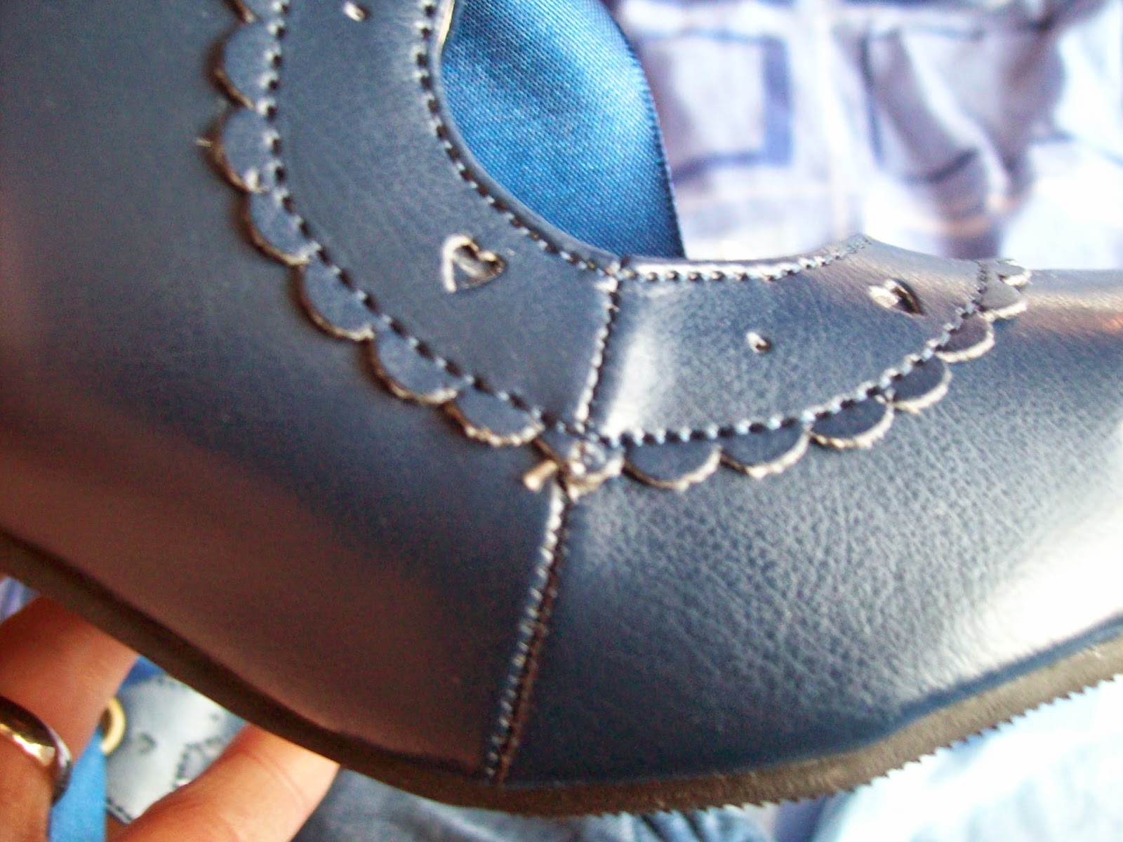
There were a few little strands of glue when I first got the shoes, which I pulled off. Overall, the materials are okay for the price you pay. The design is generally quite neatly done, but as you can see from the photo it isn't 100% perfect.

Here is a worn photo. I am so glad I ordered a size up because I really needed it. In fact, I could have probably ordered another size up as although the shoes fit me, they are a little bit snug in the toe area. Thankfully, these shoes go up to a size 43. I ordered a 41 which is about a UK 6.5 (I am a 6, sometimes a 5.5 depending on the store). The heels otherwise felt quite comfortable. I wore these shoes for about 5 hours to get an idea of how they feel and they were quite pleasant to wear. I have worn more comfortable shoes, but I don't feel these shoes are going to cause me any issues. The only thing I will mention is that the weather was quite pleasant when I was trying these shoes out, so I don't know how they will handle wet weather yet. But based on my experience so far, the shoes are very pretty looking and I think they are worth it. I am so happy with them that I am considering getting other colours.
So overall, this was quite a pleasant Taobao experience. There are a few tiny little issues here and there but nothing too concerning. I would certainly order from all of these Taobao stores again. I was so impressed with how quickly my items came and the items were generally worth the price I paid for them.
Monday 2 February 2015
Milky Cross by Angelic Pretty
Today I shall be taking a look at Milky Cross by Angelic Pretty. This series includes 2 dresses, a skirt, a hair accessory, tights, wrist cuffs and a blouse.


This is the OP. The bodice seems fairly well fitted and the shape is quite cute. I like the neckline. The sleeves look a good length and have a suitable amount of puff to them. I only wish the cuffs had been done a bit differently. The elasticated part of the cuffs really sticks out in my opinion and I wish it was narrower and a bit more concealed. I also feel too much lace has been used for the cuffs, as the way it sticks out and the amount of volume creates a weird shape. The star themed lace used for the cuffs is very cute though. The waist area has a massive bow with large tails falling down most of the length of the skirt. I am not usually a fan of massive bows but in this instance I think it is one of the best parts of the dress. The bow has a good shape and I love the way the tails fall down. The bow tails have been neatly folded and it creates such a beautiful shape. The only thing I would change about the bow is I would remove the gold stars from it, as I think that is a bit too much. The bodice features lots of neat little pleats and some ruffles of pretty lace, which give added depth and texture. The middle features a row of gold star buttons which have a cute design and are evenly spaced out. The layers of lace along the neckline have been layered on top of each other very well and it sits really nicely on the dress. Although I am not that fond of the cuffs, I do appreciate that the neckline matches up really well with the cuffs. There is a cross charm dangling from the lacy neckline, although it is quite obscured. I also feel this is quite conflicting with the more cutesy looking star buttons.
Here we can see a shot of the back of the OP and I really dislike it. I don't see how the wings fit in with anything else on the dress and they look very out of place. The gold zip also really stands out and looks very exposed. This sort of zip detail may have worked with the Holy Lantern JSK, but it looks strange paired with the soft, chiffon material used for this series. It is like AP are trying to fit in as many different trends as possible and it just looks like a mess. The back of the dress offers no shirring, so size flexibility is limited to just the waist ties.
The stock photos show the skirt has plenty of volume and flares outwards well. I feel the rounded shape fits the rest of the dress style and looks quite cute, but maybe clashes a bit with the slightly gothic print. Aside from the waist bow tails, the skirt is kept quite simple and the print is displayed very well. The bottom hem is then finished off with some AP logo themed lace. I do dislike the way the way the bottom of the dress looks with the way the chiffon layer sits on top of the solid dress. I feel it could have been done neater or perhaps it would have been better to attach the lace to the chiffon layer instead of the solid dress underneath.
Next up is the JSK. The bodice seems to be an okay shape. It is a bit simple but I think simple suits this series better. The straps on this dress are incredibly thin and look so flimsy. I don't think bulky straps would look right on this dress style, but AP definitely could have made them a little bit wider. The straps are lined neatly with lace on the outside which gives them a nice bit of added detail. My feelings about the waist bow on this dress are identical to those of the waist bow on the OP. I love the way the material falls down but I would just get rid of those star buttons. The bodice features just 2 lines of lace running up it, but with the dramatic waist bow and neckline a lot of detail isn't really needed here anyway. The neckline features multiple lines of star themed lace layered on top of each other. The lace has been layered quite well and has a very frothy appearance. My only criticism is the way these lines of lace carry on to the arm pit area, as it looks a bit bulky. Perhaps the lines of lace could have ended before the arm pits or just thinned out a little. The neckline is finished off with a small bow with a dangling cross shaped charm. I think this charm and bow are a little bit lost amongst the busy looking lace and don't really add much to the dress. It is more of a subtle finishing touch.
Again, there are some interesting things going on with the back of this dress. Unlike the OP, I actually quite like this detail. The ribbon shaped like a pentagram is such an interesting idea. I don't feel Milky Cross is the best series to be using this detail and I would like to see it be used by a more gothic lolita brand. However, I applaud AP for coming up with something unique looking and quite original. It does mean though that there isn't room for any shirring so once again the size flexibility is quite limited. Perhaps AP could have offered at least one dress with some shirring for those who need it.
The stock photos show the skirt has plenty of volume. It flares outwards well and will hold plenty of petticoat. The all-over print is displayed brilliantly, despite the large waist bow. The bottom hem is then finished off with the same AP logo lace. I am still a little undecided if I like the appearance of the bottom hem, but I think it is slightly better than the OP's bottom hem.
And finally, here we can see what the print looks like. This series is available in lavender, sax blue, navy and black. These are pretty standard colours for this sort of AP print. However, I do feel a lot of the detail looks washed out on the sax blue and lavender colour ways. If you are a fan of the print then perhaps the darker 2 colours offered would be a better option. As for the print itself, I really don't know what to make of it. Like the dress designs, there seems to be a real conflict between being cute and gothic. I do appreciate that this cutesy goth look can be quite popular, but to me this print looks like a lot of random stuff that has been chucked together. I just don't feel it works. The crosses are beautifully drawn and I love how they are decorated with flowers and gold detailing. But would I pair these crosses with teddy bears, cats and ponies? Probably not. I feel they clash far too much.
So whilst I feel the dress designs are quite pretty (with the exception of the back of the OP) I can honestly say I really dislike this series. It feels like AP have tried to take all these different trendy themes and tried to throw them all together. The print, in my opinion, is quite a confusing clash of cute and gothic imagery. Whilst cute and gothic can go together really well, I don't feel this is the case with this print. If you had to force me to pick a dress, I would choose the JSK in navy. The back of the OP is dreadful. I know this series is bound to be super popular but I personally am really disliking the direction Angelic Pretty seem to be going at the moment.
Subscribe to:
Posts (Atom)