Thursday 29 October 2015

My Ultimate Lolita Sick Day

I am writing this post on what I hope is the road to recovery. For the past few weeks I have been really unwell. I had 2 colds in a row with no break in between and then I got struck down by a small bout of flu and this is on top of my ongoing health problems. Barely able to stand, not eating very much because it was too painful and unable to sleep... It isn't really surprising that I needed some time out to recover. The real surprise was the positives I was able to take from this experience.

I am one of those people who gets very frustrated if I am not moving about or doing something to keep me occupied. I get bored so easily and so I hate being stuck in bed. But I got to the point where I had no option but to have a bed day. So I decided to turn this negative in to a positive and I ended up having a really fun day.


I did all the fun things that I don't usually leave enough time for and a lot of this did involve my favourite Japanese fashion. I dragged everything soft in to the living room and made myself a nest, I put on a pair of wrist cuffs that I usually never wear but don't have the heart to sell and got out all of my fashion magazines.

I read so many Keras and Gothic Lolita Bibles that day and it was the best thing ever. Because I suddenly had a lot more time on my hands, I read every issue with a lot more concentration than usual. I analysed every picture, I made notes on ideas I would like to try and admired all of the brand release adverts. But the best part was reading some of the issues that were around when I first started wearing the fashion. I felt that rush of excitement that I felt when I first read these magazines. It was really enjoyable to play "If I Had £1000" whilst looking at all the details in the glossy photos. I felt like a new lolita all over again.

My thirst for all things frilly was still not satisfied. So I ended up reading a lot of the old blogs that I haven't read in years. It is a real shame to see so many of the old lolita blogs haven't been updated in years. But when I was re-reading entries that I had seen from years ago, it felt like I was reading them for the first time again. It felt like I was visiting an old friend I hadn't seen in ages. And then there was the Youtube videos. I saw people sharing their hauls and opening lucky packs. I got excited with the lolitas in the videos as they saw what they got. They kept me company when my husband was away at work and suddenly I didn't feel so alone.

All of this renewed my enthusiasm for lolita fashion, and if I hadn't been so sick I maybe wouldn't of dedicated so much time to all the videos and blog entries I read. It gave me a real wake-up call. I have always been passionate about lolita, but sometimes it is easy to lose sight of why I fell so in love with the fashion in the first place. I am really excited about being well enough to dress up again and seeing my friends.

So I guess I just wanted to say a huge thank you to everybody who puts this content out there. Thank you for keeping me sane! I watched so much that day, so there is a large possibility that some of you may be reading this right now. You have all inspired me so much. If anybody reading this finds themselves in a similar situation, know that there are hours of lolita-related entertainment out there to keep you going until you feel well enough to get out there again.

Monday 26 October 2015

Florence's Medicine Chest by Baby the Stars Shine Bright

I would like to quickly apologise before today's post. I am currently fighting a series of colds and a mini bout of flu, so there is the possibility that this post may not be as good as my usual ones. My head is so fuzzy at the moment!

Today I shall be taking a look at Florence's Medicine Chest by Baby the Stars Shine Bright. This series includes 6 dresses (2 non-print), a skirt, 2 blouses, 3 hair accessories, tights, an apron and a few pieces of jewellery.


First up is the Rosalind JSK. The bodice seems fairly well fitted, but I think the overall bodice shape could have been done better. The straps are a reasonable width. They could have possibly been a little bit wider, but they seem supportive enough. I like that the straps are lined with gold braid and some good quality lace. I like the shape of the lace on the straps. However, I do feel the strap lace looks a bit overdone with the lace running along the neckline as well. I feel the lace looks messy on the neckline and it needs to be toned down a bit. I also don't like the way the neckline lace carries on underneath the arms. There is a large waist bow, which wouldn't have looked too bad if the bow on the chest area wasn't there. It looks a bit overloaded having both bows there. The waist bow has a pretty shape and it sits nicely on the dress, but I am happy to see that the waist bow is detachable. I think the dress looks a lot more balanced with it detached. The chest ribbon details have been done very neatly. Hopefully this line of ribbon wont sit too tightly across the wearer's chest. I love the shape of the bow that sits in the centre. The one thing I don't understand is why there are mini tassels dangling from the centre of the bow. They appear nowhere else on the dress and what do they even have to do with the theme? The back of the panel has a panel of shirring, which has been topped neatly with a ribbon corset. The stock photos show the skirt has a reasonable amount of volume to it and it flares outwards enough. The skirt is topped with these triangles of criss-crossed ribbon, which I think looks terrible. At least Baby didn't use velveteen like AP did for Whip Jacquard, so it is a bit of an improvement. These ribbon details could have possibly worked here if they had been placed a bit further away from each other. This detail doesn't really affect how well you can see the print though, as Baby have decided to reverse the print on this one dress (something that they have done a few times before) so the border print is actually on the bodice. My issue with this is that there are a lot of details on the bodice which conceal the more detailed border part of the print. I also don't feel that the non-border part of the print is interesting enough to have it all over the skirt instead. The bottom hem is then finished off with a line of stripy ribbon and 2 stripy ruffles. The ruffles sit neatly and have been attached to the dress well.


Next up is the Louisa JSK. The bodice looks well fitted and the shape of the bodice looks interesting. I love the heart shaped neckline, and the gold braid and stripy ruffle really emphasise its shape. I also think the use of stripes here helps to balance out the use of stripes in the print. The straps are a good width, although they seem to be made of lace. I would have preferred a less flimsy choice of material for the straps, perhaps with a lace overlay instead. The lacy bows that top the straps also look a bit too bulky and add extra volume to the shoulders. The waist area is topped with a belt made from stripy ribbon. I feel the belt makes the dress a little too cluttered. This belt is detachable and I think it looks better without it, although it does make the stripy bows at the bottom look a bit unbalanced with it gone. The bodice features 2 lines of wide lace running up it. The lace is of reasonable quality and has an interesting design to it, but I think the lace is too wide. I feel the lace would compliment the other bodice details a lot better if it was thinner. The chest area is topped with a large lacy bow. I do feel the bow looks a bit messy and it needs to be shaped better. The use of gold braid around the edges of the bow looks messy too. It is also a little bit too big. However, it does sit really well on the dress and it doesn't look droopy at all. The back offers a panel of shirring which has again been topped with a ribbon corset. The waist ties have been made from lacy material, so it really matches well with the use of lace on the rest of the dress. The stock photos show the skirt has plenty of volume and it flares out beautifully. The overall shape of the skirt is lovely. The printed part of the skirt is kept simple, so the print is displayed really well. The bottom hem features a scalloped hemline with 2 lines of lace underneath. I don't usually like scalloping, but on this dress I think it works because it has been kept subtle. The bows topping the bottom hem also help to soften the scallops. The lace used could have been a bit better in quality, but I don't think it looks too bad.


Here we have the Doris JSK. The bodice material looked a bit baggy in some of the stock photos and I think the bodice shape is too basic. The lace along the neckline helps to soften the really straight line a bit, but it doesn't appeal to me. I think the straps are a good width and look quite supportive, but they could do with some thin lace to liven them up a little. The waist area is topped with the same detachable stripy belt and once again, I feel the dress looks too cluttered with it on. For this dress, the bodice material has been broken up in to panels instead of using one continuous piece. This would have been okay, except the print does not line up properly along the seams. It looks a bit unprofessional. I also dislike how the seams have been left bare. The bodice features a double ruffle with some buttons in the centre. The buttons have a pretty design but maybe there needs to be one fewer buttons. I feel the material used for the ruffles could maybe have been gathered a bit more. It looks a little bit flat in some of the pictures and yet in other stock photos it seems to stick out a bit more. One thing I am certain of is that I don't like the double ruffle teamed with the 2 large bows at the bases of the straps. Either detail could have worked, but maybe not together. Or perhaps the strap bows could have been made a lot smaller and that would help balance it a bit better. The back has a panel of shirring but bizarrely, Baby have decided to use different solid coloured material for this shirring. I feel this makes the shirring stick out more and it doesn't look too attractive. Even the ribbon corset topping the shirring doesn't do much to conceal it. The stock photos show that the skirt has some volume but perhaps it could do with a bit more. The skirt shape looks a bit dull. I also feel the main printed fabric to lace ratio on the skirt is a bit off. The printed part of the skirt needs to be longer. The main part of the skirt is kept simple, so the print is displayed excellently. The bottom hem is then finished off with an over-stitched stripy ruffle and 2 layers of lace. I would have preferred the ruffle to be under-stitched, as I feel this would have looked neater. The bottom line of lace is also far too wide. It droops downwards a lot and lacks shape. I think it would have been better to have had more lines of thinner lace or perhaps keep the 2 lines of lace, but make them narrower.


This is the OP. The bodice seems fairly well fitted. However, I find the way the bodice has been set out (especially the sleeves) looks a bit strange. The shoulders are made of lacy material, so with the contrasting printed fabric, it gives the illusion of the dress being an off-the-shoulder design. It could have possibly worked if there weren't so many bulky details. It is too fussy and over-complicated. I don't even know where to begin talking about it! Firstly, I think the dress could have looked better if the shoulders were the main dress fabric instead of the lacy fabric. The wide line of lace running across the chest area and over the sleeves needs to go. The bulky bows and the criss-crossed ribbon going down the sides of the sleeves also need to go. The one part I don't entirely hate is the lacy bell shaped sleeves, but even then I am not too fond of the lace used! The bodice features a ribbon corset. It helps to break up the empty space on the main bodice, but given how heavy with detail the rest of the dress is, a bit of simplicity may have actually been refreshing. The chest area features a bow, which is quite big, and I am not fond of the shape either. And again, this bow has random tassels dangling from it. Thankfully, this bow is detachable. I really wish more of the details were detachable... The chest area on the lacy part is topped with a gold cross made up of gold braid, which just looks messy. If that wasn't enough detail, there are also stripy straps which tie in to big bows on the shoulders. The back of the dress offers no shirring, so size flexibility is limited. The stock photos show that the skirt seems to have plenty of volume and it flares outwards loads. There is the potential to create a very pretty full shape. From the front and back views, the print is displayed beautifully.


However, on the sides of the skirt there is yet more details! There is yet more lace and ribbons and bows. If it was me, I would remove these side skirt details all together. I absolutely hate them.

The bottom hem is then finished off with multiple lines of lace. At least it matches the very lacy theme on the rest of the dress. But in my opinion, this dress is a messy OTT nightmare.


And finally, here is the print close up. This series comes in ivory, pink, bright green and brown. All 4 colours work nicely with the print. As for the print itself, it is set out quite nicely and it looks good on the dresses. I like that the print is quite an original idea and there is quite a lot of different ways you could interpret the medical theme. I especially like the bottles. I do feel details are a bit sparse on the table though. The case on the table looks a bit like a laptop as well! I like the 2 figures in the print, but I feel like there needs to be more of them. The non-border parts of the print with the labels and also the stripy part seem to be well balanced on most of the dress designs. Out of all the dresses, I would say that the Louisa JSK probably has the best balance of the labelled boxes, stripes and border print.

So I do feel this is a really interesting print but the dress designs leave a lot to be desired. I feel this series had a lot of potential but after taking a closer look, there are a lot of things that are not to my personal taste. So this is not a series that I will be buying. If I were to go for this series, I would pick the Louisa JSK in ivory or pink.

Thursday 22 October 2015

Simple and Well Put Together Vs OTT

There is a merging trend that has been gathering pace lately. It seems old-school lolita may be making a comeback and I couldn't be happier. Whilst I myself have never really attempted old-school lolita before, I am really glad that about the effect it is having. After years of OTT dominating the online community, we are now starting to see a surge in simpler outfits. These simpler outfits are not necessarily old-school in style, but the current old-school peak is certainly having an impact in other areas as well.


A simpler outfit does not have to mean a more boring outfit though. It is about looking well put together as well. In fact, trying to make a simpler outfit can be just as tricky as doing something more OTT. Whilst with OTT you pile the accessories on, with a simpler outfit all of your accessories are more exposed. This means you have to put more thought in to what you wear, because it becomes a much stronger focus point. It is also important to not go too paired-down, as you risk looking too simple. So I have a lot of appreciation for a well put-together simpler outfit.

A more simple lolita style is also a lot better to wear on a more regular basis. Are you really going to go full OTT every day if you are just lazing about the house or doing simple errands? Even at meets, I feel a simpler lolita style works better. Wearing OTT to a picnic meet is a total nightmare! But I have seen my attitude to even outfits at bigger events has changed. When I was putting together my outfit for Regalia and I was picking out my crown, I actually came very close to getting a bigger and bulkier crown. When the crown arrived, I debated adding additional embellishments like fake flowers and pearls. Then I decided that I was being a bit ridiculous- a crown is a big enough statement on its own! And I am so glad that I did go for a simpler look with my hair accessories because in the end I was so happy with how my outfit turned out. I would just like to quickly say that I am in no way criticising the more OTT outfits at Regalia (there were some really cool ideas at that event!) but I felt that the outfit I was wearing was the right level of OTT-ness for me.


I recently wore this outfit, which I feel is not old-school but definitely takes inspiration from the classic lolita that was around a few years ago. Maybe it is because this was the sort of lolita that was around when I first got in to the fashion, but I have been growing more and more attracted to this style of lolita. I just find it a bit... refreshing. I am not turning my back on OTT altogether but I think for the moment I will be taking a more toned down approach. Who knows, maybe a year from now I will be singing the praises of OTT. I am just going to keep doing whatever makes me happy.

Monday 19 October 2015

Whip Jacquard by Angelic Pretty

Today's print focus is Whip Jacquard by Angelic Pretty. This series includes 2 dresses, a skirt, a coat, a jacket and 2 hair accessories.


First up is the OP. The bodice seems well fitted and I love the shape. I really like the contrast between the main dress and the chiffon top part. The false neckline is well shaped and the line of pleats is kept to neat and tidy. It really does look as though this is a JSK with a blouse underneath, rather than an OP. The sleeves seem to be a decent length and I like that they get really puffy towards the cuffs. The cuffs are done neatly and are finished off in a simple way with just some lace and a plain looking button. I quite like that the cuffs are not overloaded with detail. There is a waist bow, which seems a suitable size. The bow is well formed with a good shape to it. However, I feel the waist bow does somewhat blend in to the dress. Although the dress design is quite simple, I don't feel the waist bow really adds anything to the design and maybe it is not really needed. The collar is very cutely shaped and the perfect size. It is lined very neatly with some good quality polka dot themed lace. The collar is then topped with a velveteen bow, which finishes things off neatly. I am a little unsure about the use of velveteen here, especially when it isn't used anywhere else, but I don't feel it looks bad. The back offers no shirring, so unfortunately the sizing is a bit limited. I do feel the zip line stands out a bit on the lighter colour ways, but it is otherwise quite neat and tidy looking. The stock photos show the skirt has lots of volume and flare to it. It will hold plenty of petticoat and the shape of the skirt suits the bodice shape. The skirt design is kept clutter-free, so the print is displayed perfectly. The bottom hem is then finished off with some lovely bow themed lace. 


Next up, we have the JSK. The bodice seems well fitted but I feel the overall bodice shape is lacking something. The neckline shape is also quite harsh and I feel it needs to be a bit more rounded. I really hate how thin the straps on this JSK are. If it wasn't for the generous ruffles of lace lining them, they would almost be non-existent. They look so flimsy and I can't imagine them holding up very well. There is a massive waist bow. It is far too bulky, even if it does blend in with the print. The shape of the bow is quite good and holds up well for a bow of its size. It doesn't work at all though, and I would not have bothered with a waist bow at all, especially when the bodice is so full of details. The bodice features 2 ribbon corsets which use velveteen strips to lace them up. I think these details look terrible. The placement of these details doesn't look right and the velveteen looks too bunched together. It just looks really messy and it also looks especially strange teamed with the waist bow. I am also not keen on the choice of velveteen material here. In addition to the velveteen corset details, there is a line of large buttons going up the middle and some thick braid running along the neckline. The buttons don't look too bad, but I think there needs to be fewer of them. I am not impressed by the braid because it looks a bit out of place teamed with the rest of the design. The back has a panel of shirring, which has been topped neatly with the ribbon corset. The stock photos show the skirt has a great amount of volume and it flares outwards quite well. There is the potential to create a nice, full shape. The skirt is generally kept quite simple, so the all-over print is displayed very well. However, there is more of that velveteen ribbon at the bottom of the skirt and it looks terrible. It looks so flat and lifeless and it just doesn't work. The bottom hem is lined neatly with a line of the cute bow themed lace.


And here is the print close up. This series comes in ivory, pink, mocha and brown. These are quite standard colour choices for a chocolate themed AP print and I can see why some people are worried this print is being released in place of AP's usual annual chocolate series. The colours do work quite well with the print. As for the print itself, I think it is boring. It has lots of cute things, like whipped cream and icing, but it all looks too simple. It just goes to show that even if you take a common sweet theme, it doesn't necessarily mean it is going to be a success.

So I feel this series is a big disappointment and there is nothing here which really looks that special. I can appreciate that sometimes a simpler, understated print can be amazing, but the dress designs really have to be strong to make it work. Sadly, the dress designs leave a lot to be desired. The OP may look quite cute, but that is mainly because AP have played it very safe with the design. The JSK design is a mess. So I think it is safe to say that I would not buy this series. The OP in brown would be my top choice if I did like it. I am writing this post 3 days after the series was released and the majority of the colour choices for both dresses are still available. For an AP release, that really says a lot.


Thursday 15 October 2015

Taobao Ring Review and Latest Taobao Haul- Picture Heavy

Today I have a new Taobao order to review, but first up, you may have noticed I have gone with a different shopping service than my usual go-to of Taobao Spree. When I placed my last Taobao order I unfortunately had one seller who was holding things up, so I split my order in to 2 packages. But in the time after my first parcel was shipped and I was waiting for my last items to arrive at their office, Taobao Spree decided that they were no longer accepting Paypal payments and now you have to "order" through this store to pay for your orders. So I went through this process and to be fair to Taobao Spree, I did get my items and I was able to pay my last shipping part okay. However, it does feel like an added hassle and so, I decided to give a different shopping service a try. So I went to another well known shopping service- Taobao Ring.

Ordering Process and Communication

One of the things I really hated about Taobao Spree was having to fill in that spreadsheet and even when I copied and pasted my details from my last order, it could get very time consuming. Taobao Ring on the other hand, have a "quick order" where you simply paste in the links and then the colour, size options, etc just come up. If you have any further comments it is really easy to add them on. Once I had created an account (which is very simple to do) I was able to fill in my quick order form with ease. I got emailed when payments were due and the process was explained on the site so I always knew what the next step was. What I really liked about Taobao Ring was that you could log in and see which of your items had arrived at their office. So it was easy to see if the stores were delivering their items on time. I can say that all the stores mentioned in this order delivered on time and one shop even sent their item weeks before they were due to arrive. However, one of the things I did dislike about Taobao Ring is that it felt a bit impersonal. With Taobao Spree you are assigned an agent and some of their agents (especially Ray!) were really easy to talk to and it felt like they genuinely cared about your order. With Taobao Ring you don't get told who is looking after your order. I suppose the only time you would really contact them personally would be if there was a problem with your order. As my order had no issues, I had no reason to contact them. So I can't really comment on how they handle problems.

Shipping and Packing


I went with the EMS shipping option. I liked how the Taobao Ring website had a shipping calculator so you could get a rough estimate. Taobao Ring do not automatically mark your package down, so I assume you have to ask if you want this done. When the package eventually made it through customs, I was a bit surprised at how small the box it came in was. Although the box was well taped up, it was obvious the box was too small for the contents, as it was bulging outwards. There were a couple of holes in the box. When I opened the box, there was a layer of bubble wrap placed on top but nothing else. The 2 hats I ordered were very badly squished.


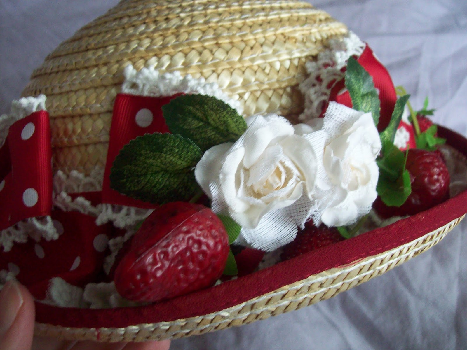
First up today is this hat I ordered from Haruhi Clover which as you can see, got a bit bashed in the box. Thankfully I was able to simply pop this hat back in to shape. 


As you can see, the hat is as good as new. I think that says a lot about this hat because it can quite clearly handle a bit of bashing about. I have previously ordered this hat in navy, so I knew exactly what to expect. The hat is an okay size, but perhaps not suitable if you plan to wear a very thick wig. 


The ribbon used for the bow is a little bit shiny (although I should mention this photo was taken with a flash) but otherwise it is lovely. The edges of the ribbon were carefully and neatly sealed. The bow is well shaped and the pearls are a nice finishing touch.


The lace used is of a good quality and it is placed neatly on the underside of the rim. I did notice the ribbon seemed a little bit loose around the base of the hat compared to the hat I ordered previously, but it is nothing to drastic and this is barely noticeable unless you are looking for it.


Next up is this strawberry hat that I ordered from Infanta. Unfortunately, this hat also got a bit squished in the box and part of the rim has warped slightly. I have been trying my best to mold the hat back in to a shape I am satisfied with and although this has worked slightly, it still isn't quite right. I don't know if it was already like this when it reached Taobao Ring, but given that both hats got squished this time and in a previous order with Spree my Haruhi Clover hat was packaged very well, my guess would be it was probably Taobao Ring's packaging that is at fault. 


One side of the hat is topped with fake berries and flowers. I personally don't feel like the materials used were of the best quality here. The fake roses look a bit shabby and some of the petals are even a bit threadbare. The fake berries do not look very realistic and I feel they need a bit more of a sheen to them as well. But my main issue is that it feels as though these details are a bit overloaded. I have noticed that one of the berries will frequently pop out and over the side of the hat and I think it is because there is not enough room. 


The ribbon used on the hat is very cute though and I love the vibrant colour. The ribbon has been used very neatly along the base of the hat and also for the bows. The lace used is of a good quality too. I love the little lace hearts! There were a few small loose threads but nothing too substantial.


I am a little confused by the inside of the hat. There is one single alligator clip placed on one side but nothing on the other side. I think if you are going to use these clips inside, you need one of both sides because if the wind blows your hat off, one clip is not going to be enough. I am actually tempted to remove this clip altogether as I found it awkward to use and it just got in the way. I feel like I got what I paid for with my hat, but some of the details are definitely a bit too low quality for my personal tastes.


Next up is the first of many neck accessories I got in this order (I felt my wardrobe was sorely lacking neck details). I got this rose themed necklace from Ranka.  I was really impressed with how well Ranka wrapped up the necklace. It arrived pinned down on this display board and was then thoroughly wrapped in bubble wrap. The necklace is mostly made up of beads and clear plastic thread. It is not the most sturdy of materials but it should be supportive enough that I will get a good amount of wear out of this necklace. The length of the necklace is good and the chain is long enough to adjust the length. 


I was really impressed with the quality of the fake roses used. The petals are well formed and there is a slightly glossy finish. The beads are well positioned around the fake flowers. The overall composition of the necklace has been well thought out and it looks very balanced. I am impressed enough with the quality to say with confidence that I would order from Ranka again.


Next up is a lot of items from Ciciworks, or as they now like to be known- SweetDreamer. First up is these ribbon brooches. Sadly, these brooches were also a victim of some bad packing, so the ribbon is going to need to be flattened out somehow (any suggestions on the best way to do this will be most welcome. I am thinking I will sandwich the ribbons inside some heavy books). Apart from that slight issue, I am impressed with these clips. The colours of the ribbons are so vibrant. The ivory one is perhaps a little more yellow than I was expecting though.


The ribbon used is gorgeous with a pretty rose design to it. All of the materials are of a good quality. My only slight gripe is that little effort was made to tidy up and seal the ends of the ribbon, so that is something I will have to take care of before I wear them. 


The back features a pin and clip, so it can be attached 2 ways. I am really glad about this (I thought it was just going to be a pin on the back) because it means I can now use this accessory in more ways. The back of the bow on the red clip does look a bit messy, but the bows are otherwise well shaped.


I was pleased to see that the charms in the centre arrived in perfect condition. As you can see, the crown is not missing any diamantes and the jewels on the other 2 clips are perfectly framed in a neat gold frame. The pearl chains are a good length and aside from one side of the ivory clip (on the right hand side of the picture) the chains have been attached to the bow neatly. These clips are very beautiful and I am so glad I ordered them. But it is a bit annoying that I am going to have to seal the ends of the ribbon myself and there are a few small flaws in places.


These chokers are also from Sweet Dreamer. I got them mainly because they were cheap if I am being honest. The chain is long enough to alter the size of the choker, but I did have some problems (see below). 


The lace used for the chokers is lovely with a really pretty rose design. The ribbon threads through it perfectly and I like that the ribbon is only slightly shiny. The charm in the middle of the choker is pretty, although I feel the velvet bow could have been shaped better.


The chokers looked great laid flat, but I wasn't so impressed when I tried them on. I found that no matter how tightly I did the choker, it was still loose on my neck (and I wouldn't say I had the smallest of necks either). I managed to get a photograph before it started to fall south. Another issue is that despite the charm being pretty, it is too heavy. The charm tilts downwards and the weight encourages the choker to fall down. I also had a bit of an issue with trying to get the pearl chains to sit right and they kept bunching up. I am debating removing one of the pearl chains because as it is, it looks too clustered. Hopefully that will help with the weight problem too. Overall this was quite a bad buy and I am glad I didn't spend too much on them.


The last item from this store is this white veil I got. I was impressed by the shape and it falls nicely when worn. I personally would have preferred a softer main material choice.


The lace used has a pretty design and it is of a good quality. You can see there is a lot of lace where it has been gathered at the corners but I don't think it looks too bad. The lace could have been done neater but it looks reasonably okay.


The veil is secured by 2 small grips. I do feel that I would need some extra bobby pins, just to make sure it sits better on my head. But actually, the grips worked better than I was expecting. When I went to take the veil off, the grips refused to let go of my hair!


I apologise for not doing a full worn photo, but I have been feeling unwell after my flu jab and I didn't want to show my puffy, drowsy face. I opted for the shorter length which is about chest length. I am glad I picked the length I did. The veil fell nicely around my head and I like the shape. I found the veil was easy to put on and I had to do minimal adjusting. I think with this veil I got what I was expecting. Sweet Dreamer's quality can be a bit hit and miss, but I would still recommend them for padding out accessories.


Next up is these ballerina style ribbon socks, which I got from here. The store name-drops a couple of different brands, so there is the possibility these may be replicas but I don't follow the brands in question, so I have no idea. The socks arrived in a mesh bag and came with a free tube of sock glue. Very handy! The socks were a good size for my wide 24.5cm feet. They could probably go a little bit bigger, but not much more. 


The details on the back are so cute. I love the soft, fluffy appearance. The ribbon used for the bow is a bit cheap looking but I was otherwise very satisfied with the materials.


I love the ballerina charm! It is so pretty. It does get a bit lost underneath all the other details though.


Although the socks did come with sock glue, I decided to see how long they would stay up without sock glue (answer- just over 5 minutes). I found the ribbons were long enough to cross over my legs twice. I probably could have tied them up a bit neater than I did here!


This is what the back details look like when worn with shoes. I would worry that with very flat shoes there would be the possibility of the tulle getting caught underneath or dragging on the floor. But the bows do hold their shape fairly well. I am not 100% sold on these socks but I think they are an interesting idea and I will be keen to see how well they last.


And finally, here is a head chain that I got from here. I was curious about the head chain trend, but I had a lot of concerns about them, so I wanted to try a cheaper alternative to the ones Baby the Stars Shine Bright have done. Straight away, I found some random little bits inside the bag. I can't find anywhere where these bits could have fallen off, so I am hoping they are just extra bits that got in to the bag! 


I was initially very intimidated when I got the head chain out of the packet. It was quite tangled and I spent about 10 minutes trying to figure out how to put it on my head. There are just so many strands of pearls that it is easy to get confused. Eventually I was able to get it on the right way, but it was a little bit big for my head. I had to adjust it to get it to sit on my head in what I felt was the best position, which caused my hair to get a bit messy. It does look a bit prettier in person than it does in my photo. The pearls look good. One of my worst fears came true though- when I tried to get the chain off it got really tangled in my hair! So my verdict is that I wont be extending my head chain collection any time soon. I do feel that this Taobao version looks as good as the Baby ones though and it is definitely worth the price. I guess I just need to learn to how wear it a bit better!

So overall, I had a bit of mixed luck with this order and I am feeling torn about which shopping service to use for my next order. I am really not convinced that Taobao Ring's service is as good as Taobao Spree. I am going to give Taobao Ring another chance before I go back to Taobao Spree though. There are some things which I feel Taobao Ring do better and I love the quick order option. As for the items I received, I feel some could have been better but some of them are definitely worth the price I paid. I was especially impressed with Haruhi Clover and Ranka. The socks are going to be fun to try out as well!


Monday 12 October 2015

Banquet in the Dark Night With Dancing Roses by Alice and the Pirates

Today I shall be taking a look at Banquet in the Dark Night with Dancing Roses (also known as Dinner) by Alice and the Pirates. This series includes 3 dresses, a skirt, 3 hair accessories, tights and gloves.


First up is JSK I. The bodice seems well fitted and the shape is lovely. It does feel as though the bodice should sit higher up though. Perhaps the neckline sits a little too low or maybe it is just the way it looks in the stock photo and it actually looks better in person. The straps are a bit thin and could perhaps do with being a little bit wider. The straps have been lined neatly with lace on the outsides and the lace has been well gathered. I like how the lower part of the bodice mimics a corset. It helps to emphasise the waist area. The pleats and lines of lace have been done so neatly. It gives the bodice an interesting texture as well. There is a line of buttons in the centre, but I personally feel they are a bit too bunched together and it would be better if there were a few less buttons. The chest area has an overlay of lace with lines of lace running along the edges, which I have been feeling very unsure about. I think the gathering could have been done a bit better but I do like how there is a bit of added volume at the chest, which looks great teamed with the more fitted waist. I also feel that this lace overlay works better on certain colour ways than it does on others. This lacy chest area is topped with 2 ribbon bows, which I think look a bit out of place. Maybe there could have been just one bow and it should have been on the neckline instead. The ribbon used for the bows is also very shiny, which really sticks out. The back has a panel of shirring, which has been topped neatly with a ribbon corset. The stock photos show the skirt has an okay amount of volume for a more subtle look. I don't think you are going to be able to go too full with this skirt. It doesn't seem to flare out that much. The skirt has been kept simple in design and the print is displayed beautifully. The bottom hem is then finished off neatly with a line of good quality lace.


Next up today is JSK II. The bodice looks well fitted, but I am not overly keen on the bodice shape. I feel the neckline shape is a bit too harsh as well. The straps are a decent width and look fairly supportive. I like that both the insides and outsides of the straps have been lined with lace. The lace sits nice and flatly. The lace chosen has a pretty design as well. The bodice features a lace jabot. The jabot is set out quite nicely. I would have maybe have liked to have seen more layers of lace instead of going for wider lace with just 2 layers like AatP have done here. The ribbon used for the bow part is also very shiny again. The emblem in the centre of the jabot has a lovely design though. The back of the dress is fully shirred, which means better size flexibility but it isn't that appealing to look at. The stock photos show the skirt has a reasonable amount of volume and it flares out nicely. I like the length of the skirt, which has allowed for the higher waist. The overall shape is lovely. The skirt is again kept simple and the print is displayed really well. The bottom hem is then finished off neatly with a line of the same lace as the other JSK.


This is the OP. The bodice seems well fitted but I really dislike the shape. With the OTT neck ruffle which has a lot of volume, it makes the dress look a bit top-heavy. It needs to be toned down a bit. I know if I was wearing this dress I would get very irritated by the neck ruffles. The sleeves also look quite frumpy and I think that is because they are too long in length and need to be slightly more puffy. I am not overly keen on the lace on the end of the sleeves either and would have preferred a thinner line of lace. There is a line of lace topping the waist line. I feel it adds volume to the waist area and makes the overall dress shape look a bit lumpy. It doesn't seem to 'flow', if that makes sense. I like the lacy shoulders, but I think it is a bit unbalanced. It looks out of proportion with the ruffly collar and the rest of the bodice. The rest of the bodice has been kept completely plain as well, which looks very dull and quite flat. The bottom of the lace part is topped with a very shiny ribbon bow, which looks a bit out of place. I don't know if perhaps it needs to be placed elsewhere or to not bother with a bow at all. The back offers no shirring at all, so the sizing is a bit limited. The back has been set out quite neatly and the zip line is well concealed. The stock photos show the skirt has a good amount of volume and it flares outwards quite well. There is enough room for a decent amount of petticoat. The printed part of the skirt is kept simple with no clutter, so there print is displayed quite well. The bottom hem is then finished off with a line of lace and 2 wide ruffles. The lace is lovely but I feel the ruffles look a bit flat and stick limply to each other.


And finally, here is the print close up. This series comes in beige, bright green, brown and black. At first I thought the colours looked a bit dreary, but they have grown on me. I actually quite like the beige and green versions. The black is okay, but I am not so fond of the brown in the print combined with black. As for the print itself, it is laid out nicely. I liked how there is a staircase breaking up the arches in the background. The flowers entwined around the stairs are pretty. The table is set out nicely and I like all the little details. It is quite a mature looking print. The one thing I don't like is the non-border background. It just doesn't appeal to me and I am glad that the border part takes up most of the skirts.

So overall, this is a lovely print and some of the dress designs are quite good. I definitely feel some dress designs are stronger than others. I am sorry, but I hate the OP! The print is beautiful and I like the more mature look. Would I buy this series? Maybe, but it wont be going on my wishlist. My top choice would be JSK I in beige. I can imagine there being some very elegant outfits using this series in the near future.

Thursday 8 October 2015

It's Okay To Be A Bang-less Lolita

Bangs- I hate them. I was having a conversation with another lolita recently and the subject of hair came up. She asked me why I chose to not have bangs because it seems that "most lolitas have them". This is not the first time my bang-less hair has been up for discussion and somebody once said about one of my outfits that they really liked it but that they "wished I had bangs".


I suppose when you look at a lot of the big name lolita models, they do all have bangs. Every time I look at a picture of Misako Aoki I ask myself how on earth does she keep her bangs looking so perfect all of the time? But to imply that it is somehow "more lolita" to have bangs than to not have bangs seems a bit strange. It is hardly as vital as a petticoat!

I actually did have bangs up until the age of 15 (and no, you cannot see a picture!) and I hated it so much. When I finally got past that awkward growing out phase, I was so relieved to be finally rid of that bit of hair. It may sound silly, but bangs simply do not suit my face shape and I felt a lot better with them gone. And there is nothing that will convince me to get bangs cut back in. Every time I am at a lolita meet, there is usually at least one person is constantly brushing their bangs before we take photos and also during photo taking, because it is not sitting right. Then there is the maintenance. I always found when I had bangs, that they got oily before the rest of my hair did and then there is the constant trips to the hairdresser to make sure it isn't long enough to get in the way of my eyes. When I was younger my mum unfortunately insisted on me going to the worst hairdresser ever. My mum has always been quite frugal and this lady was cheap but sadly, this hairdresser was terrible at cutting bangs. There was the time when I had a triangular fringe, the fringe that was going at a diagonal and the time I had one of those dreadful 1 inch long fringes (long before hipsters started getting them, and I can tell you I did not look cool at all). Everybody else found it hilarious but I was dying of embarrassment! My sister would then have to trim my bangs afterwards to put me out of my misery. So maybe now you can understand why I am so determined not to ever have bangs again!

But that is enough ranting, it is time I got to the point. Lolitas come in many shapes and sizes and we all learn what dress shapes suit our figures the best. We sort of accept that we are never going to look good in certain styles of dresses and yet, we are able to adapt the fashion to suit us. We settle for a different dress cut, we add under-skirts if we are tall, we pick extra shirring if we are carrying a bit of extra weight. Hair styles are exactly the same. Some people just don't look good with bangs and we just work around it to make our hair style suit us. Bangs may be fashionable in lolita but it is not compulsory. I had bangs and they didn't work for me. I don't feel any less of a lolita for not having them now. To be honest, I care a lot more about the clothing and accessories than I do about a little bit of hair!

Monday 5 October 2015

Pastoral in the Grass Green by Baby the Stars Shine Bright

Today I shall be taking a look at Pastoral in the Grass Green by Baby the Stars Shine Bright. This series includes 4 dresses (one non-print), a skirt, 2 blouses, socks and 5 hair accessories.


First up is the Firomera JSK. The bodice seems fairly well fitted and although the bodice shape is simple, I think it works great. I think the straps are a decent width and look very supportive. I feel the bows on the shoulders is a bit too much though, and just adds unnecessary bulk. The flower lace on the insides of the straps is of a good quality and it is interesting to look at, but I don't really like it on this particular dress. I also feel it is a little strange how the flower lace switches to a thinner, simpler lace style at the chest area. I would have much preferred just having the thinner lace the whole way up the bodice and along the straps. There is a waist bow, which is a bit big in size but I feel the larger style of bow works on this particular dress. The shape is interesting and well formed. This bow is detachable, but I would leave it on or maybe place it just a tiny bit higher up than Baby have done for the stock photos. The bodice features a ribbon corset layered over a lace panel. The ribbon is very well spaced out and the loops holding the ribbon in place are quite well hidden. The panel underneath looks good too. There is then a semi-circle area at the chest, which has a gathered lace panel. The lace seems of a good quality and the gathering gives the area a bit of extra movement and depth. There is then a strip of the printed fabric running on top of this lacy area, which is then topped with a printed bow. I am a little unsure if I like this printed fabric here or not, as I think it maybe pushes the bodice details a little bit too far. I do love the bow though, and the ribbon used for this bow is beautiful. The back of the bodice features a panel of shirring which has been topped very neatly with a ribbon corset. The back generally looks very tidy, although I don't like how the flower lace on the straps continues a little bit down the back. I don't like the way the lace comes to a sudden stop. The stock photos show the skirt has a fair amount of volume that would suit a classic shape. It flares outwards fairly well but doesn't look too OTT. The skirt design is kept simple, so the print is displayed perfectly. The bottom hem is then finished off with an even more detailed line of flower lace, which looks very pretty. 


Here we have the Frantiska JSK. The bodice looks well fitted, but I think the shape is a bit too basic. The straps are a reasonable width and I love the double layer of lace along the outsides of the straps. The lace is gathered so well and it creates a very cute shape. There is a large waist bow which doesn't look that well shaped. The bow is also a bit droopy and I fear it makes the waist area look bulky. This waist bow is detachable, and I feel the dress looks a lot better without it. There is a belt of the printed material at the waist area, which is lined with a line of lace at the top and bottom. I personally dislike the lace used here, because I feel it sticks out at an awkward angle. For some reason, I also feel that this dress has weird proportions and maybe the band of fabric at the waist needs to be a bit wider and end a bit higher. But in all honesty, I would have loved it if this had been a high-waisted skirt instead of a dress, as I am not overly keen on the bodice of this dress anyway. There is a lacy yoke on the bodice. The yoke is a good shape and I do love the way the lace has been layered inside the yoke. However, what I am not so keen on is the flower shaped lace around the edge of the yoke and also the bow sitting underneath it. I am disappointed that this bow doesn't seem to be detachable, as I think it would have looked a lot better sat on the neckline instead. The flower lace around the edge of the yoke is somewhat concealed by the voluminous lace inside the yoke too. The back has a panel of shirring, which has been topped neatly with a ribbon corset. I like that the waist ties of the dress have an over-lay of lace on them, which is a nice finishing touch. The stock photos show the skirt has a decent amount of volume and it flares out very well. There is the potential to create a lovely shape. The skirt is quite simple in design, so the print is displayed beautifully. At the sides, there are little raised bits filled with lace, which gives the bottom of the print a more interesting shape. The lace here is layered quite neatly. The bottom hem is then finished off with 2 layered lines of lace. This lace is also lined neatly, although it doesn't seem that the lace is of the best quality. 


This is the OP. The bodice material looks a bit baggy in places and I am not too keen on the overall bodice shape. The neckline shape looks a bit strange to me and a bit too simple. I really hate the sleeves. The sleeves seem to be different lengths in the stock photos (here is hoping the actual dresses wont be wonky too!). The sleeves also have a bit of a weird shape to them and look a bit slouchy. I also dislike the strip of the print going across the sleeves in this way. Basically, I hate everything about the sleeves and think this dress would have looked a lot better as a JSK! There is a large waist bow, but it has been done in a similar way to the one on the Firomera JSK, and I feel it works quite well. The waist bow is detachable, but I would definitely leave it on. There is also a band of the print running horizontally across the waist area and unfortunately this hasn't been done that neatly and it sits weirdly. I do love the line of ribbon threaded lace that tops the waist line though. The lace has a really pretty design to it with lots of detail and the ribbon threaded through it adds an interesting burst of colour. This ribbon threaded through lace detail is continued on the rest of the bodice as well, with a line running up the bodice, another line on the neckline and also the neckline bow. These details make the bodice look a lot more interesting and adds a bit of added texture and detail. Inside the neckline, there is a lacy panel. This keeps the neckline quite modest. The only thing I don't like about this part is the ribbon threaded through the lace and then tied in to a bow. Even though it is only a thin bow, I feel it is one bow too many. The back offers no shirring, which means the size flexibility is a bit limited. The waist ties are also quite thin, so they probably wont do much to affect the sizing. The zip is quite well concealed. The stock photos show the skirt has a generous amount of volume and it flares out well. The silhouette is a bit lumpy though, which can be explained by the details on the side of the skirt.


Here we can see a side view of the skirt details on the OP. There is a line of flower shaped lace which runs down the sides of the skirt and then along the bottom hem. This line of lace is then further topped with some ribbon bows. This is a very interesting idea, but I don't think it has been executed that well. The style of lace used means it could stick out awkwardly and not sit flatly on the dress. I also feel the ribbon bows are too large and look a bit bulky. The bottom hem is then finished off with a further line of wide lace, which has been done neatly, but from the front view I think the bottom looks a bit lace-heavy.


And finally, here we can see a part of the print close up...


... and this picture shows what the bottom of the print looks like. This series comes in red, green, navy and brown. I think that all 4 colour choices work well with the print, but the brown colour looks a little bit dull. I feel the combination of colours on the green version, and especially on the navy version, are very bold and striking. As for the print itself, it is all set out very neatly with a tidy pattern. I really love the floral panels. The flowers have been drawn so well with lots of detail. I like the combination of the flowers with fruit too. The lace also looks beautiful and has lovely details to it. The print has a very folk feel to it which works well with classic lolita. Everything works together.

So overall I feel this is a fantastic print, but I am not completely sold on the dress designs. I am especially disappointed by the OP. But at least there is also a skirt available. Would I buy this series? Possibly, but it wont be going on my wishlist. My choice would be the Firomera JSK in navy. The navy blue colour is just stunning and I am thinking up all sorts of outfits that would make use of all the colours. Judging by the site listings, it seems people agree with me about the navy blue being the best colour!

Related Posts Plugin for WordPress, Blogger...