Thursday 28 January 2016

The Hybrid Lolita

When you start out as a lolita, chances are you were told to stick to the 'rules' and were given clear cut guidelines about the 3 main styles of lolita- sweet, classic and gothic. When somebody is a  new lolita, I feel the 'rules' are important to help give some structure and guide you when you are making your first purchases. Even though the 3 main styles have many sub-styles (such as country, sailor or pirate) chances are, you were advised to stick to one of the main 3 styles to begin with.

As time went on, I realised not everything is so clear cut after all. Actually, the 3 mains styles can sometimes blend with each other. Take the Holy Lantern series from Angelic Pretty as an example...


If you were to show this to one person they may tell you that as this dress has crosses and darker elements to it, it is probably gothic lolita. Show it to somebody else and they will tell you that it is still sweet lolita. Maybe somebody else would tell you this dress fits the creepy cute style (Is creepy cute still a thing? I have not heard that term in ages...). Which person is right? Well, in some respects, all of these people would be right. This is just one example of a piece which doesn't neatly fit in to the confines of one style. But maybe that is okay.

This is not anything remotely new to lolita fashion. Innocent World may be known as a classic brand, but there has always been some more cutesy sweet elements to their pieces in comparison to other classic lolita brands, like Juliette et Justine for example. A lot of sweet brand Baby's pieces are bordering on classic. This new style of what I call 'hybrid lolita' has definitely become more prevalent in recent years. The Japanese brands are pushing the boundaries more than ever. Of course, it makes tagging outfits on Tumblr a bit more difficult but apart from that, I see no harm in the styles blending.

I personally am a big fan of blending sweet and classic lolita together and I would go so far as to say that some of my outfits could be labelled as being "Sweet-Classic Lolita". It is not sweet or classic- it is both. There are some benefits to blending the styles together. Recently, I have noticed I am a little more self-conscious about wearing sweet lolita. Sweet Lolita is still a style I wear frequently but I feel like I have my own limitations with how cute I am willing to push an outfit. Maybe it is because I started off being an average age for a lolita, but I would now be considered a mature lolita. I am by no means the oldest of lolitas, but I would probably say I am at the age where I fit in to the older lolitas age-group. I have noticed I don't feel as comfortable wearing sweet as I did when I started out in the fashion. I even sold some of my sweeter dresses because I felt too insecure wearing them.

But by introducing what would be considered more classic lolita elements in to my sweet outfits, I am finding that I am still happy to wear sweet lolita. I am relieved about this because even though I do wear more classic now anyway, I still have a place in my heart for sweet lolita. I guess by introducing the more classic elements, I am in effect making my sweet outfits more mature and perhaps a bit more suitable for my age. Yes, people still think I am younger than I actually am, but I still feel more comfortable in my hybrid of sweet and classic than I do in just standard sweet. It also works the other way around. Sometimes when wearing classic lolita I will add a few cuter elements in or maybe a sweeter colour.

It is also quite a lot of fun being able to blend accessories in combinations that you would not usually expect to work together. If you take away the usual boundaries on what style something fits in to, I think there is the potential to come up with loads of new ideas. Even though crosses are typically seen as a gothic lolita staple, I think crosses look amazing in some classic lolita outfits too. Flowers are a good example of a theme which works well across all the 3 main styles of lolita. The colour combinations are also more varied. Who says that classic lolita should always be muted colours? Why should sweet lolita always be sugary pastel coloured? If something works and looks great, then does it really matter if it doesn't fit neatly in to one style?

There are certain situations where labeling outfits can prove useful, but I don't feel it is always necessary. If something looks amazing, does it really matter if it doesn't fit neatly in to one category? At the end of the day, lolita is a fashion, and a big part of fashion in general is adapting it to make it work for you and having fun experimenting.

Monday 25 January 2016

Twinkle Sky by Angelic Pretty

Today's print is Twinkle Sky by Angelic Pretty. This series includes 2 dresses, a skirt, 2 head bows, tights and a parasol.


This is the OP. Firstly, I would like to say that I am not that fond of the choice of fabric throughout this series. The main dress fabric looks super shiny and maybe even gives off the impression of being a bit cheap. Also, it looks like the sort of fabric that would wrinkle easily. Back to the OP, the bodice seems well fitted, although I feel the shape is a bit basic. The length of the sleeves seems decent. I think the arms have a good amount of puff to them, but the cuff part could have been shorter. Maybe the wrist area could have just been gathered and then had some lace instead of the large cuffs. There is just something about the cuff shape which doesn't seem to look cute enough for this particular dress, in my opinion. There is a waist bow, which is a cute shape and size, but is made of very shiny ribbon. It sits nicely on the dress too. This bow is detachable but to be honest, the dress is already so shiny that I don't feel a shiny waist bow is really going to hurt at this point, so I would leave it attached. The bodice details are really neatly set out. I like the pleats, as they give the bodice a bit of extra texture and depth. The ribbon corset in the middle is nicely spaced out and I like the thin lines of gold lace too, as the colour of the lace helps to break up the bodice. My least favourite bit of the bodice is the collar. Usually, this would be a really pretty collar, but I don't think it works on this specific dress. I think the shiny fabric used is partly responsible, but I also feel a round collar shape would have looked cuter than a square shaped collar here. On a more positive note, I like the use of gold lace on the collar and the lace lining the collar is pretty too. The back of the dress offers no shirring, so size flexibility is pretty limited. The stock photos show that the skirt is very full with plenty of volume. The skirt flares out well and I love the rounded shape. There is more than enough room for petticoat underneath this skirt. The skirt is kept simple in design, so the print is displayed really well (if you can even see the print). The bottom hem is then finished off with a line of AP logo lace, which is layered over a chiffon ruffle. Although the lace does feature stars, I was a bit surprised that AP didn't go for a more obvious star themed lace. Despite the lace and chiffon ruffle being layered well on top of each other, I don't really feel the chiffon ruffle is needed either.


Here we have the JSK. The bodice looks well fitted, but the shape of the bodice looks really plain. I dislike the really straight neckline and think something a bit more heart shaped would have been more flattering. Even the thin line of lace along the neckline does nothing to soften the harsh shape. The straps are quite thin, and don't look that supportive, but I don't think wider straps would have suited this style of dress. I like that the straps are lined with lace on the outsides, but I am not overly wowed by the choice of lace used here. The lace is of a good quality, I just don't like its appearance and I don't feel it suits this dress. There is a waist bow, which is once again super shiny, but everything about this series seems to be shiny. The shape of the bow is cute and I don't even mind the long tails going down the skirt like that. It sits nicely on the dress too. The bodice details are pretty much identical to those on the OP, and they are set out in the exact same neat way. Everything is nicely spaced out and well balanced. The back is fully shirred, so there is lots of size flexibility, but it isn't too attractive to look at. The stock photos show that the skirt has loads of volume and it flares out a lot too. My only concern is that it looks as though the ruffles at the bottom are giving the skirt a bit of an odd shape at the bottom. Hopefully it looks better in person than it does in the stock photos. The skirt is kept simple in design, so the print is displayed beautifully. The bottom hem is then finished off with a very thin line of lace and 2 ruffles. I feel very undecided about whether I like the way the ruffles have been done or not.


And here we can see what the print looks like. This series comes in ivory, blue, wine, navy blue and black. They are mostly pretty standard choices for a starry themed print, although the wine colour is a bit unusual. I can't decide if I like that colour or not. I would be more inclined to play it safe with one of the blues or the black version. As for the print itself, there isn't really anything amazing about it. The constellations are good, but they look very basic. This print just looks like a poor version of AP's Cosmic print, which at least had writing and moons on it to make it more interesting. The grid on this print does not really add anything to the design either, and just gives the print a tiled appearance. But I think the worst thing about this print is that you can't even see it that clearly in the first place. If you look at any picture of this series online, the print is barely visible. It makes me wonder, what is the point?

I am struggling to find anything really positive to say about this series. As far as I am concerned, the print is awful and the choice of fabrics for the dresses is terrible too. The dress designs are underwhelming too. So I think it is safe to say that I will not be buying this series. If you want a decent constellation print, go for Cosmic. If I absolutely had to choose a dress, I would go for the JSK in navy. However, I do think the parasol released as part of this series was pretty decent looking, so that is something worth checking out. As for the rest of this series, something tells me it will be lingering on AP's website for a while.

Thursday 21 January 2016

Lolita Desu Review- Positive

Today I shall be reviewing an order I placed with Lolita Desu, who are a second hand Japanese fashion store. To tell the truth, I actually put in 2 orders with Lolita Desu quite close together. The order I am reviewing today is the 2nd of the 2 orders I placed. The only difference between the 2 orders was that with the first order I requested Airmail and the second order was shipped by EMS. I didn't take photos of the 1st order because I was initially not planning to to a Lolita Desu review. Anyway, the first order went through really easily and the Airmail was actually really quick. I only went with EMS for this second order because it wasn't a great deal more expensive and I have more experience with using EMS. I received the same high level of care with both orders, so here I shall share with you my review of my 2nd order!


Ordering Process and communication

The Lolita Desu website is quite clearly set out and easy to navigate. You can search by categories such as 'lolita', but I prefer to see specific brand categories using the links near the bottom of the page instead, as I feel that gives me a fuller picture of what is available. The cart system was really simple and I was able to place my order with no issues at all. I got all of the emails quickly. I can't comment too much on the communication, because I had no problems at all and didn't really need to contact Lolita Desu at all.

Shipping

For this order I used EMS, which I felt was reasonably priced in comparison to similar websites. My order was shipped out the next working day and it arrived super quick. The whole process was really quick. Both Airmail and EMS come with tracking, although when I ordered using Airmail I did find I had trouble using the tracking when it got to the UK (apparently Royal Mail had a fault with their tracking page, so it was out of Lolita Desu's control anyway).


This is how my order arrived. It was shipped in a simple envelope. I would have preferred a bubble envelope for a bit of extra padding, but when I opened up the package I saw why Lolita Desu hadn't bothered with bubble wrap.


Instead of a bubble envelope, my necklace arrived in a tupperware container! I don't think I have ever seen this before! And on the inside the container was padded out with sweets. So the necklace was quite safely padded and I also got loads of free sweets. I thought when I saw the candy in the picture above, that was it, so it was a surprise to get even more free candy inside! My other order had free candy in it too. Some of the candy was really yummy, but I wasn't sure about the tomato flavoured sweet!


And here is the necklace I ordered. I have been looking for a suitable crown necklace for ages, and this Angelic Pretty one is exactly what I was looking for. On the website, the item condition was ranked as B but after a thorough examination, I can't see a single thing wrong with it. I suppose A rank is reserved for brand new items though.


I thought I would take a few little close up shots of the necklace. I love the design so much.


So all I can do is heap praise on Lolita Desu for providing a great service with no hassle at all. The site was a pleasure to browse and I like that there is a reward system too. I already have about $10 worth of points saved after placing 2 really small orders. The orders were really safely packaged too, albeit a bit strangely! I would definitely recommend Lolita Desu to other lolitas and I will be ordering again in the future.


Monday 18 January 2016

Wonder Carousel by Metamorphose

Today I shall be having a look at Wonder Carousel by Metamorphose. This series includes 3 dresses, a skirt, 3 hair accessories, socks and tights.


First up is the Bustle JSK. When you ignore all the distracting details going on, the actual bodice itself seems well fitted and the neckline has a cute shape. I really dislike the 2 sets of straps on this dress, especially together. The regular set of straps has a suitable width and I like that they are lined with gold lace. However, the ruffled organza on this set of straps is really messy looking and makes the shoulder area look too bulky. I also don't feel this set of straps suits the bodice. I feel the halter neck straps are a better match for the bodice, but sadly this set of straps is made from flimsy organza and would not be supportive enough on their own. Instead of having 2 sets of straps, I would have just had a set of halter neck straps made out of the main dress fabric. The shiny ribbon bows at the bases of the regular straps add to the bulk as well. The halter straps are detachable on this dress, and I would definitely detach them, just to help tone things down a bit. The bodice also features a massive chest bow, with trailing tails going along the sides of the bodice, and 2 smaller bows. I don't feel that the chest bow is that well formed and the bow shape is not immediately obvious. It needs to be better defined. The material used for all the bows looks a bit cheap too, especially the tacky looking gems placed on the centre of each bow. As if this dress didn't already have enough bows, there are further large bows at the waist area, which are attached to the organza over-skirt. The over-skirt itself looks pretty decent. It sits nicely on top of the skirt and ends long before the border print. It has a good shape and I quite like that it has been lined neatly with gold lace as well. The waist bows however, are too OTT and add unnecessary bulk to the waist area. I wouldn't have bothered with having these waist bows at all but I think that even a smaller size bow would have been a big improvement. The back of the dress is fully shirred, which means plenty of size flexibility, but exposed shirring which is not too attractive to look at. That being said, this dress is so overloaded with details, maybe nobody will notice the shirring! The back of the skirt features a massive organza bustle. The bustle has a nice number of tiers, which are spaced out decently. However, the bustle is very voluminous and it sticks outwards loads, so it is not the most flattering dress if you are a bit self-conscious of how big your butt looks. I also think that it is far too much to have both the over-skirt and the bustle teamed together. It pushes the OTT elements way too far for my liking but also, I don't think these 2 details work well together. The skirt itself has plenty of volume and it will hold more than enough petticoat. From the front view, the print is displayed really well too. The bottom hem is then finished off with an organza ruffle which is further lined with gold lace. At least it matches the rest of the dress, I guess.


Next up we have the Angel Collar A-Line Dress. The bodice is very short but what there is of a bodice looks really cute with a nice shape. This dress is not going to be very chest friendly though. If the waist line was a bit lower down it would be so much more wearable. The arms seem to have a decent amount of length to them and I like the slight puffiness to them, which doesn't look too OTT. The cuffs are really cute too. They are nicely gathered, finished with a line of lace and topped with a ribbon bow. I think they have just the right amount of detail to them. The waist line, or should that be chest line, is topped with a double layered bow. The bow looks quite well formed and the shape suits the dress. I think the sizing of the bow goes well with the dress too. The bodice has multiple lines of lace and a line of buttons too. These details are perhaps not needed on a bodice so short, especially with the collar too, but the details have been set out neatly and look nice all the same. The collar is super cute and has been well shaped. However, I am not entirely sure the angelic shape of the collar really ties in with the rest of the dress theme. I really love how this collar looks though, so I am hopeful we will see this collar shape again in the future, hopefully on a more suitably themed dress. The back offers no shirring, so size flexibility is a bit limited. I guess with a bodice this short there isn't really any room for shirring anyway. The back looks very neat and tidy. The collar looks good from the back view as well. Despite the dress being quite sack-like in design, there is a bit of a defined shape there and I like the way the skirt flares out. The skirt seems to have a decent amount of length to it and there should be enough room for petticoat too. The skirt is kept very simple in design and the print is displayed beautifully. The bottom hem is then finished off neatly with a line of lace.


This is the Ribbon Dress. The bodice seems well fitted, although I think the overall bodice shape could have been a little bit better. The neckline and sleeves give off a bit of a frumpy vibe in my opinion. Although too much lace can be a bad thing, I think in this instance the sleeves and neckline could have done with a bit more lace, or at least some more interesting looking lace. The neckline looks very bare and too basic. The waist area is topped with a double layered ribbon bow. The bow looks a suitable size and the shape of the bow is cute and well formed. The layer underneath is a bit too shiny, but it is mostly obscured anyway. This bow is detachable, but I personally feel the dress would look too boring without it. The bodice is divided up by several thin lines of lace. The lace is set out nicely, but it doesn't really feel that exciting to look at. There is also a line of pearl buttons going up the middle, which helps to break up the empty space. The buttons at least have a pretty design to them. The chest area is then topped with 3 small bows. The bows are a good shape and are well spaced out. The back has a panel of shirring, which has been topped neatly with a ribbon corset. The stock photos show the skirt has loads of volume and it flares out beautifully. I love the full, rounded shape and there is a lot of potential to create a really lovely silhouette. Such a shame I am not really excited about the rest of the dress... The skirt is kept simple in design, so the print is displayed excellently. The bottom hem is then finished off neatly with a line of lace and topped with 2 shiny looking ribbon bows. 


Finally, here we can see the print. This series comes in bordeaux, smoky pink and navy blue. At first I was really unsure if I liked the colour options for this series but on further reflection I think the colours work okay with the colours in the print. I can't say that I have any strong feelings towards any of the colour options though. As for the print itself, I think it is a very interesting take on the carousel theme. I know that carousel prints have been done to death, but the choices of animals keeps the print looking fresh. Yes, Angelic Pretty did Fantastic Carnival with the different animals, but AP didn't use anything as fierce looking as the amazing looking tiger in this print! I think the more mature colours in the print keep it from looking too similar from a lot of other carousel prints too. The animals in this print are drawn well. I especially love the swan for some reason. I like the swirls of gold too. I am a little unsure about the stripes hiding behind the animals though, as I think it would be better if the animals stood out a bit more. I am also not keen on the floral lines that are a part of the non-border part of the print. I just don't think they fit in that well.

So I think this is an interesting print, but the dress designs have left me feeling a bit cold towards this series. In my opinion, one dress looks too OTT, one goes too far the other way and looks boring, and the other dress looks a bit difficult to pull off unless you have a very specific figure. So I guess all that leaves is the skirt! I am not exactly amazed by any of the colour choices either. They look okay, but I would struggle to pick a favourite colour. So this is not a series I would personally go for. I can see it appealing to some Meta fans out there, but I will be giving this a miss. I guess I would go for the Ribbon Dress in navy blue if I had to pick a dress.

Thursday 14 January 2016

A Small Taobao Order From December- Picture Heavy

Back in December last year, I managed to fit in a small Taobao order before Christmas. As I didn't leave enough time to review it then, I shall be reviewing it now instead! I used Taobao Ring again and to be honest, I think I will be going back to using Taobao Spree.


The reason why I want to switch back is that my parcel was over-stuffed once again. I know the hat was easy to reshape, but Taobao Spree have never squished any of my items in a too-small box. When I got the parcel it was literally bulging and I was scared to open it, in case I accidentally cut in to any of my items!


I got myself another Haruhi Clover bowler hat. I wont review it again, as I think you all know by now that I really like them, but I thought I would share a photo anyway.


I also got this beret from Haruhi Clover. I am on a bit of a burgandy binge at the moment! I was having issues with the lighting for the photos in this post, but the colour of this beret is really nice in person. 


The bow clip is detachable, so you can move it about. There were a few little strings of glue visible on the back on the bow but the bow was otherwise well done. 


The ribbon used for the bow has a pretty design. It is a little bit shiny, but not too bad. The shape of the bow is alright. It could be better, but it could have been a lot worse too.


And here is a worn photo (I was too lazy to put some make up on!). My initial impressions are that the beret itself was comfortable to wear. My only slight criticism is that I think the pearls look a bit bulky. Perhaps smaller pearls could have been used here? I do have this slight concern that if I end up walking too fast the pearls are going to be swinging and then whacking me on the forehead, but at least the bow can be re-positioned.


I also got these socks from here because anybody who knows me well will tell you I love anything with ducks on it! I ordered 3 designs and I found that it was quite easy to select the designs I was looking for. For example, the duck with the question mark above its head was labelled "?" and as none of the other designs had a question mark, I knew I was selecting the correct design. I was really pleased to see that these socks are meant to fit up to 25cm, as usually they go up to about a 24. I usually go for a size 25 when I am ordering shoes, so I am happy that this time I wont have to stretch the socks too much. The colours of the socks were every bit as vibrant as I was hoping. The design on the socks is quite clear with neat lines.


I did notice one pair of socks had a slight bit of dirt on them (which you can barely see, so I added some arrows) but I usually wash items like socks before I wear them anyway. It looks to me that it was some sort of mark that got on the socks in the factory or warehouse, rather than somebody wearing the socks. The mark came out really easily when I washed them.


I was really pleased with how the socks looked when worn. You can maybe see a tiny bit of white on the toes where the fabric has stretched, but apart from that they are perfect. They fit my feet quite well and feel lovely and soft.


Next up is these feather clips from here. I was really pleased to see that the Taobao store made the listing super clear, so I knew I was definitely getting a pair of clips. I've had issues with ordering stuff like wrist cuffs from Taobao in the past, where I have only received one cuff, so it is good to know exactly what I was ordering with these clips. I was relieved that the Taobao store sent the clips to Taobao Ring in a box, given my experiences with Taobao Ring and their lax attitude to careful packaging. It also means I have a box to store the clips in.


The feathers are generally quite nicely shaped, although inevitably they are a tiny bit messy in places. I found I was able to tidy them up a little, just by twisting the feathers back in to shape.


The brooch charm at the bottom of the clips is really pretty. I love the gold frame and the pearls arrived in perfect condition with no scratches on them.


The clips on the back are at an angle, which makes it a little bit easier to place them on my head. I did find that I had a bit of trouble getting the clips off my head though, as it was hard to get a decent grip on the clip without disturbing the feathers. 


And here is a rough idea of what they look like when worn. I think the sizing looks pretty good. They are quite a bold hair accessory and make a big impression with little effort.


And finally, I ordered this necklace. It definitely looks a lot better in person than it does in my photos. The first thing I noticed though, was that the necklace has a bit of a smell to it. It smells a lot like Vicks Vaporub! It sort of makes me wonder how they made the necklace... The chain is a good length and has a simple clasp to do it up.


The necklace has such a beautiful design to it. I don't feel my pictures capture the colours and the shimmer very well. I love all the little charms and the way the crystals have been placed.


The backing has a lovely design to it too. Despite the slight smell, I am really pleased with how the necklace turned out.

So this was overall quite a pleasant Taobao order and I am really pleased with every single item I ordered. I will definitely be keeping an eye on the shop I ordered the feather clips from in the future, as I am excited to see what other sort of accessories they come up with in the future. I have decided though, that I will probably be trying Taobao Spree again. After a few orders, I am still not convinced I like Taobao Ring's service, especially with their dodgy packing. It is a shame, because Taobao Ring's ordering process is a lot easier. But I am willing to go back to Spree if I have the peace of mind that my items will arrive packaged better.


Monday 11 January 2016

A Print Double

It's only January and I am already having to double up on prints! Scroll down further to see my views on Baby's Creamy Berry Fairy Dream.

First up today though is The Grace ~ Hymn of the Departure ~ by Alice and the Pirates. This series includes 3 dresses (one non-print), a robe, a skirt, 3 hair accessories, a rosary necklace and something called a train, which looks like something a vicar would wear.


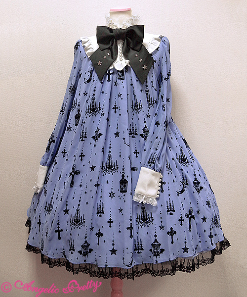
First up is JSK I. The bodice generally looks well fitted, but the material looked a bit baggy in some of the stock photos. Although the shape of the bodice is a bit simple, I think it works quite well. The straps look a very supportive width and they are lined really neatly with pretty lace on the outsides. I did initially think the straps could have been a little bit thinner, but on reflection I don't think they look too bad. The bodice features a line of lace running across the chest area. The lace has a pretty design and hopefully it wont sit too awkwardly on the wearer. There is also 3 quite large bows on the bodice. I really don't like how shiny the bows are and I also think the bows look too cute for the print. Also, I think that the spacing of the bows on the bodice looks a bit 'off'. They could have been positioned a lot better than this. I don't like the way they are clustered together at the bottom of the bodice, especially when they are as big a this. The neckline is lined reasonably well with lace. It could have been done neater, but it looks acceptable. The back has a panel of shirring, which has been topped neatly with a ribbon corset. The stock photos show the skirt is very full and rounded. It flares outwards beautifully. I really love the shape of the skirt in the stock photos, especially teamed with that bodice shape. The skirt features an open front with a bustle. The print is still really well displayed at the sides and back despite this bustle being there. I really like the way the bustle has been set out anyway. The layers are soft, so it doesn't stick outwards too much. Everything is well spaced out too, and I love the lace used on the bustle. The bottom hem is then finished off with this gorgeous lace which has this pretty crown design to it. 


Next up is JSK II. From what we can see of it, the bodice seems well fitted. The shape of the bodice is really basic, but a more complex shape probably wouldn't have suited the overall look of this dress. I think the straps are a decent width for this style of dress, although they do look very plain, as there is no real detail to them. There is a waist bow, which is a good size, and the shape of the bow is interesting too. The bow sits on the dress well too, with no obvious signs of drooping. This bow is finished off with 2 small tassels. I don't really get the point of the tassels, but they are not too distracting. The waist bow is also detachable but actually, this is one of those occasions where I prefer the dress with it left on. The majority of the bodice on this dress is covered by the 2 really wide lines of lace going along the neckline. Even though the lace has a pretty design, I really hate how the lace has been used. I feel it looks a bit messy and gives off the illusion of drooping. But I think what really bugs me about this lace is that the rest of the dress looks quite basic in design, so the OTT looking lace looks a bit out of place. I think there at least needed to be more lace like this near the bottom of the dress to help balance out the overall design a bit better. The back of the dress is fully shirred, which means plenty of size flexibility, but it is not that appealing to look at because it is very exposed. The stock photos show the skirt has a good amount of volume to it. It flares out well and there is the potential to create a good A-line shape. The skirt is kept simple in design and the print is displayed perfectly. The bottom hem is then finished off with a thin line of good quality lace. But as I mentioned, it doesn't really look that well balanced with the lace-heavy bodice.


And here we can see the print. This series comes in pink beige, mint, navy and black. All 4 colours look amazing with the print and I am actually having a really difficult time picking a favourite colour. They all look beautiful in their own special ways. As for the print itself, everything is really neatly set out. I love the golden arches with all their little details. The pictures inside the arches are a little bit too religious for my own personal tastes, but they are drawn well and I can see them having wide appeal. I also really like the flowers near the bottom of the print. However, I am not too keen on the music lines and floating crosses in the print. I don't like the solid coloured background behind the music lines and would have preferred to just have the music lines floating on the background of the print. I don't like the crosses because they are just floating randomly without much purpose. I get the feeling that AatP thought they were doing a religious themed print, so they had better stick some crosses in there, but they didn't really think about where to put them. The crosses could have easily been included within the arch part of the print instead of being aimlessly stuck on the top, just floating in thin air. The background of the print is full of detailed, but kept muted enough to not be a distraction. 

So I get the impression that this series could do well for Alice and the Pirates. There are a couple of things I would want to change about both dress designs though. In my opinion, the bodices are what lets down both dress designs. The print is gorgeous though. Would I buy this series? Probably not, for the reason that religious prints are not really my thing. I still think its quite a good series though. My top choice would be JSK II in navy blue, or possibly the black. I know that if I owned that dress though, the neckline lace would bug me! Maybe I would opt for the skirt instead.

Today I am also taking a look at Creamy Berry Fairy Dream by Baby the Stars Shine Bright. This series includes 2 dresses, a skirt, 4 hair accessories, 2 blouses and 2 pairs of socks.


First up is JSK I. The bodice looks well fitted. The shape of the bodice is a bit simple though, and I am not keen on the straight neckline. I think the straps are a reasonable width and they suit the style of the bodice well. They are a bit simple though, with no lace lining them. The bodice features a semi-circle line of lace, which also goes along the neckline. The lace itself is really cute, with a pretty strawberry design, but overall I am a little underwhelmed by the design. The line of lace is topped with a stripy bow. I think the size and shape of the bow is cute, although the placement looks a bit odd to me. I also feel the stripy fabric for the bow sticks out and doesn't really fit in with the rest of the dress. There is also a large chest bow, which does feel a bit big in size for the chest area. The shape is cute though, and it holds its shape well, with no signs of drooping. This bow is detachable, and I would detach it, perhaps using it as a waist bow instead or maybe even as a hair accessory. The back of the dress has a panel of shirring, which has been neatly topped with a ribbon corset. The stock photos show that the skirt has a brilliant amount of volume to it and it flares outwards plenty. I love the rounded shape, and it should hold plenty of petticoat. The skirt is kept relatively plain, so the print is displayed perfectly. There is a thin line of lace running across the skirt, but it blends in with the print really well and it isn't too much of a distraction. The bottom hem is then finished off with more cute strawberry shaped lace.


Here we have JSK II. The bodice shape looks too square and not that figure flattering. The straps are a decent width and look very supportive. They are lined neatly with lace on both the insides and outsides, but thankfully it doesn't look too bulky. It adds a bit of interest to the straps too. There is a waist bow, which looks quite big, but I think the size suits the dress. The shape of the bow is cute and it sits well on the dress too. However, I think the waist bow seems to be lacking something. Maybe it is because the bodice has a lot of lace, so it is making the waist bow appear a bit too basic. The waist bow is detachable and I think I would detach it. As mentioned, there is a lot of lace on the bodice, with 2 wide lines running up the bodice and going across the chest area too. The lace looks to be of a reasonably good quality, although it feels as though Baby have used the kind of lace that was popular around 2008. It looks a little bit dated. I also feel the lace going vertically up the bodice is too wide and looks too bulky. The chest lace is topped with a line of the stripy ribbon, which is then used for a generous sized bow in the centre. Again, I don't really feel the stripes fit in with the rest of the dress. Perhaps Baby could have added 2 small stripy bows to the bottom of the dress to help balance it out a bit more? The stripy ribbon also features the pretty Baby logo charm dangling from the centre, although the bow does obscure it a tiny bit. The back is fully shirred, so there is plenty of size flexibility, but it doesn't look too attractive. The back is quite short, so perhaps they didn't feel they could fit a smaller panel and a ribbon corset on the back. The stock photos show that the skirt has a decent amount of volume to it and it flares outwards well. The shape does look slightly triangular in the stock photos, but I am sure there is a lot of potential to create a cute shape. Again, the skirt design is kept simple, so the print is displayed really well. The bottom features a scalloped hemline. I am not usually a fan of scallops, but it has been done quite gently and the scallops are well formed. The line of lace behind the scallops helps to soften the shape as well. The lace for the bottom hem is again of an okay quality but feels quite out-of-fashion.


And finally, this is the print. This series is available in off-white, pink, red and mint green. These are pretty standard choices for a berry themed print. They all work with the colours in the print too. Other colours like black may have looked a bit strange with the brown in the print. As for the print, it looks cute enough. I don't personally feel the berries look that realistic, especially the chocolate they are dipped in. They still look pretty though! My favourite part of the print is the chocolate lace. It has such a lovely design with plenty of detail to it. I am not too fussed by the flowers in the print, but they are subtle enough and don't stand out that much. I adore the chocolate ribbons and bows in the print. I love how there are those little strawberry and chocolate cone sweets in the print too. It reminds me of those chocolates that Meiji make! Although the print has the brand name in the print, it doesn't look too showy, and I love how it is spelled out in chocolate letters. It is nothing too original, but it works well.

I can't believe I am already talking about berry prints, and it is only January! As far as berry prints go, this one looks cute but I wouldn't say it was anything special. The dress designs look pretty good, although this series wouldn't look too out of place if it had come out a couple of years ago. Would I buy this series? Possibly, because I do like strawberry prints. I wont be going out of my way to get hold of it though. My top choice would be JSK I in mint green or maybe the off-white.

Thursday 7 January 2016

Things I Would Like to See in 2016

It's that time of year again where I look to the year ahead and have a think about what I personally feel could benefit the lolita community over the next 12 months and ideas I would like to see. Looking at my list from 2015, it looks as though a lot of them didn't come true sadly. Maybe I will have a bit more luck this year. So here is my list for 2016 and let's see if anybody agrees with me!


Less Crosses- I have nothing against crosses, in fact I do have some cross themed items in my wardrobe and I love them very much. But 2015 felt like the year when crosses became too big a thing and they started to get randomly inserted in to prints that really did not need them. The one that instantly comes to mind to me is Angelic Pretty's Cherry Marguerite, with the daisy crosses. The crosses looked cute, but did the dress really need the added crosses to an already busy print? In fact, AP seemed to be the biggest offender and there was one point in 2015 when every single release had crosses in there somewhere. I am hoping that this was just a trend and hopefully this trend will ease off a bit next year.

Blouse Only Lucky Packs- I very briefly touched on the idea of blouse-only lucky packs in last year's post but I decided to elaborate on my idea a little further, as it is something I am surprised hasn't really been done. A lot of lolitas may be surprised to hear this, but there is a large chunk of lolitas who maybe don't wish to add more dresses to their wardrobes. It could be an issue of space, or that they don't feel they wear the dresses they already own enough to justify getting even more. Perhaps a lot of the releases in the past year simply didn't take their fancy. But I feel blouses are a bit different. They are an essential item in any lolita's wardrobe (unless you stick to only OPs, which I don't know of many lolitas who do this) and you can never have enough of them. If you wear lolita frequently enough then having those extra blouses is useful. I remember when I was starting to build my wardrobe and it seemed like I was always waiting for a blouse to dry when I had washed it, and I didn't have another blouse which matched an outfit I wanted to try out. I would love to see Baby do a blouse lucky pack, maybe with one simple cotton blouse and one chiffon blouse with fancier sleeves. It could come in colours like off-white, black, pink and ivory so that there was a colour option for most styles. I can say truthfully that I have never once looked at a lucky pack exclusive print dress and fallen in love with it. But I feel that I would find a blouse lucky pack very useful indeed.


More Scarves- One of my biggest self-discoveries in 2015 was that I really love the idea of printed scarves! When Metamorphose released Fortune Tarot I wasn't interested in the dresses- I just really wanted the printed scarf that was part of that series. Sadly, it sold out so quickly that I never even saw the black one go up on the website. Towards the end of 2015, Meta started to release more scarves, and I hope this is a trend that continues. I think scarves are a fun idea and I wouldn't necessarily wear them with just lolita. I know that if I eventually track down that Fortune Tarot scarf I will have a lovely, warm neck over the Winter months. I don't just want to see more printed scarves, some cute solid colour designs would be useful as well. I struggle to find scarves that match my outfits and a lot of the scarves that lolita brands do put out tend to be cutesy animal shaped ones. There needs to be more variety!

An Innocent World Duck Print- Here we go with the duck prints again! But I am really pushing the idea of an Innocent World one because I would love to see their sweet/classic take on a duck print. I am not talking of overly cutesy cartoon ducks. I want to see the sort of ducks that you see a lot of in children's book illustrations- a bit like the ones Beatrix Potter used to draw. Innocent World did do a Peter Rabbit series, so maybe this idea is not as random as it seems. I feel like this would be a fresher take on the duck print idea because the duck prints that are out there (like Meta's March of the Duck) have a very overly sweet look to them. Wouldn't you be curious to see what Innocent World would come up with?


More Hats- 2015 was the year I officially became obsessed with hats. I love the vintage feel they can add to an outfit but also, they are simple to wear. I love the bowler hats I have from Haruhi Clover, because I can simply chuck them on my head and that is my hair accessories sorted for the day. But it isn't just bowler hats I am interested in. Last year I saw a lot of different vintage inspired hats, which looked stunning. There were large rococo designs, boater hats, cloche hats... There are so many different options and that is what I love about hats. They don't have to always look the same. I love how a lot of lolitas are getting hats commissioned or have found beautiful vintage pieces. Now I would like to see hats become even more widely available. I have seen more lolita-friendly hats popping up on Taobao and I would love to see more.

Sticking to similar shades of a colour- If any readers of this post wear colours like lavender, then you will definitely feel my pain. No 2 shades of lavender ever seem to match in lolita. I have started to have this problem with other colours like pink as well. Maybe I am being a little bit too nit-picky, but when I am wearing mis-matched shades of a colour, I tend to start noticing it more and I get paranoid that it sticks out and other people are noticing it. But the really strange thing is, sometimes you can buy items from the same series and they will be different shades! It is really frustrating when you are trying to add a colour to your wardrobe and you can't even buy items from the same brand without worrying that they wont go together. When it comes to colours like lavender, I have gotten in to the habit of just sticking to either cold or warm shades, even if the shades are not exactly the same. But this wouldn't be such an issue if the brands just stuck to the same shade in the first place!


Less Sack Dresses- Let's be honest here- how many lolitas do you know who actually look good in those shapeless sack dresses? It takes a very specific figure to wear a sack dress and even then, that is no guarantee that it will look good when worn. They are not in any way boob-friendly and you have to be fairly petite. But even then, sack dresses can swamp a smaller person's figure. I have seen some people wear sack shaped dresses with a belt, but when I see people do that I do sort of wonder why they didn't just choose the other dress cut instead. Maybe we need to have a bit of a break from the sack dress and focus more on dresses that actually look good when worn.

More Balance between OTT and simpler pieces- Some lolitas dislike OTT and some lolitas seem to wear nothing but OTT outfits. So when I see a new series coming out, I find myself looking at the dress designs and looking to see if they will appeal to a wider audience. I personally like the more simpler dresses, because I can then use dressier accessories if I want to go OTT, but at the same time I can wear the dress more casually if I am just hanging out with a few friends. But I appreciate that different lolitas look for different things in a series. It feels like with some series all of the dress designs are very OTT and as a result, I feel that it puts me off the series, even if I really like the print. But there are other times when the dress designs go too far the other way and are very simple and (dare I say) a bit boring. In my opinion, a brand release is best when it has one more dressier OTT dress, a simpler dress with a more mature look and perhaps a more cutesy looking dress. I personally love it when brands put out pieces that can be worn in a more casual way as well. A bit of variety can help a brand release appeal to a wider audience of lolitas.

So that is my list for 2016. Let's wait and see if any of this list actually comes true or not! And do feel free to comment and let me know what you would like to see over the next year. It is always interesting to get the view point of other lolitas! I would love to know if you agree or disagree with my ideas.

Monday 4 January 2016

My Christmas Adventures!

Hello everybody! I hope you had a great Christmas and I wish you all a Happy New Year! I am feeling completely exhausted after all of the festivities but at least I had a good time. It was really good to catch up with a load of my friends. I decided to share some tales of my Christmas adventures (well, the ones with any remote connection to Japanese fashion anyway. I doubt anybody really wants to hear the story of me visiting my mum and other daughterly duties...)


My Christmas break started with me wearing my last lolita outfit for 2015. Shalisa, James and I went over to Sammi's place for a Christmas gathering. Yes, I know I am wearing a strawberry print and it is not very festive. I wasn't really in the mood to wear a more festive themed outfit, so in the end I just wore what I wanted. I think a big part of lolita fashion is to enjoy dressing up and appreciate the clothes, so there is no point wearing something I don't feel like wearing. I didn't do anything too radical with this outfit as I haven't really had the time to think up some new outfits lately.


I got to meet a very energetic puppy! This is Sammi's corgi puppy, who is called Biscuit (such a typical Sammi name!). He is such a little cutie and his fur is so soft and lovely. I really hope I get another opportunity to meet him some day, provided Sammi doesn't mind me invading her flat! We also had a quick peek in to Sammi's wardrobe, as it was the first time we had really seen it all together in one place. Sadly, some of my photos of her wardrobe came out a bit too blurry, so I decided not to share them.


We got to open some of our presents. Here is a shot of Shalisa examining one of her gifts. I think Sammi and Shalisa liked the gifts I gave them. That is what they told me anyway! I completely forgot to take a picture of the presents I got. Sammi got me some stationary, socks and a beret. The beret has a moon on it! Shalisa's presents unfortunately got stuck in the mail but she did give us these reusable carrier bags. Mine has a duck design and I love it! It is already proving super useful and I have been using it loads.

We had a good catch up and laughed at some dodgy Youtube videos. Of course, we had to get out usual Domino's pizza order! It has become a bit of a Christmas tradition. We had a bunch of friends over a few days later and I ended up eating Domino's again, which turned out to be a bit less fun because I went in to what I call "Post Pizza Regret Mode". I felt so sick! Anyway, after our pizza binge we ended up watching this absolutely dreadful movie and then we dropped off Shalisa at the train station. I was feeling very tired at this point, but it was really good to spend some time with my best friends over the Christmas period.


Shalisa was not the only one having Christmas post dramas... I managed to win an auction for Chess Emblem a couple of days after the release, but it got well and truly stuck in UK customs. It was in the UK from early December, but it was not going anywhere. I was getting really concerned that I wouldn't get my package before Christmas but on December the 23rd it finally arrived! This was after a 2 hour phone call to customs, a very nasty customs fee and several panic attacks... I believe Chess Emblem is the only print from 2015 that made it on to my wishlist and I loved it the second I set eyes on it. I can confirm it is just as beautiful in real life as it is online. There are so many little details to it. I keep finding new details to fall in love with! I am hoping to get the matching beret at some point, but it is not an urgent priority of mine. For the moment I am really glad I was able to find an auction only a few thousand yen above retail price, as the prices for this series have since gone up a fair bit since. I did toy with the idea of wearing it on Christmas Day, but I decided to save it until I get some more bits to go with it.


This year I decided to join the Tea Party Club's Secret Santa event. I saw the event from the previous year and decided it looked like fun. I really love the secrecy of it all and knowing you could get almost anything. It is a bit of a gamble, but I think it paid off. The photo shows what I got from my Secret Santa. The fur shawl (fake fur thankfully!) is so soft and I keep stroking it as if it is a kitten or something! I love getting cute storage containers too. My Secret Santa also made me this beautiful headdress and I love it. I am definitely going to have to make a special outfit to go with it. Thankfully the person I gave a gift to apparently liked their present too. I was really worried they were going to hate it! It felt really exciting to attempt to put a thoughtful gift together for a stranger and it was surprisingly stress-free. I will definitely be doing this again next year.


And now I am going to do a mini review of the Japanese Fashion related Christmas presents I got from James. He isn't quite confident enough to dare ordering from Taobao yet, so I ended up with a lot of stuff from My Lolita Dress! I got given these navy blue and gold tights from Petite Luna (I think that is the Taobao store name?). The tights have a reasonable amount of stretch, although I wish the material was a little bit thicker. The pattern is lovely though, and when the tights are worn the pattern stretches okay. I was worried that the glitter would start to crack when they were worn and stretched out, but they seem fine for now. We will have to wait and see how well they last after a couple of wears and washes. The gold was a bit darker than I would have expected, but it is still very pretty. I would definitely consider ordering tights from Petite Luna in the future.


He also gave me a brooch from Vanillas Traumfabrik, which is a store I have always been curious about ordering from. The brooch is absolutely beautiful with a fantastic design to it. The ribbon rosette part is well formed and the chain and charm is a suitable length as well. 


I am pleased that the back has a 2-way back, so I can wear it more ways. You can perhaps see just a tiny bit of glue on the back. But this glue is in no way visible from the front and I am very satisfied with the overall quality of the brooch. I really want to go and order this in more colours now! Royal/Regency themes are a favourite of mine at the moment.


Finally, James got me this Mu Fish beret in black with silver embroidery. If you look very closely at the embroidery you can tell there is a slight hint of silver to the thread but actually, it looks more white than anything else. But this is actually how I was hoping it would turn out, as I really wanted this style of beret with white embroidery! If you do want a more silver colour though, then you may be disappointed.


The embroidery has been nicely done and the design is clear. I couldn't find any obvious mistakes anywhere on the beret.


The only thing I am slightly unsure about is this embroidery on the rim, which will appear on the forehead when worn. The embroidery itself it well executed with crisp letters, I'm just not sure I like this part of the design!

So I think that essentially covers everything fashion related that has gone on for the few weeks I have been away. Hopefully I will soon slot back in to my usual everyday routine and I will write plenty of blog posts for the upcoming year. Thank you to everybody who continues to stick with me and my little adventures. I hope you all had a great Christmas. Here is hoping 2016 is a fantastic year, in and out of lolita!

Related Posts Plugin for WordPress, Blogger...